MAKING PRINTING EASY WIRH 'A DESIGNERS GUIDE TO PRINT'

Branding | Publication design

THE PROBLEM

Sometimes, graphic designers struggle with understanding the requirements for outputting documents, especially for print delivery. With the lack of resources available on this topic, graphic designers that are newly entering the field are thrown into the deep end as they have little knowledge of the prepress process. I created a visual identity as well as an informative book called ‘A Designers Guide To Print’ to help struggling graphic designers with the prepress process.

RESEARCH

The research stage includes defining the target audience and gaining a deeper understanding into the people affected by creating personas, empathy maps and conducting interviews. Competitors are also looked at to see what has been done in the past and whether or not these ideas have worked.

1. PERSONAS

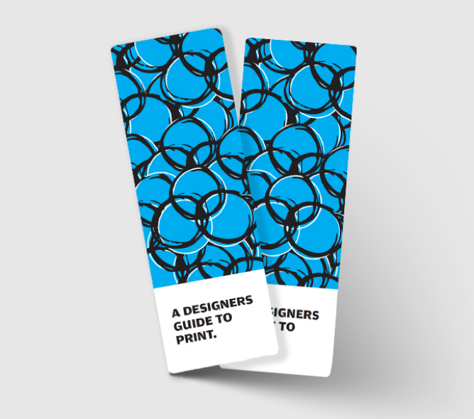
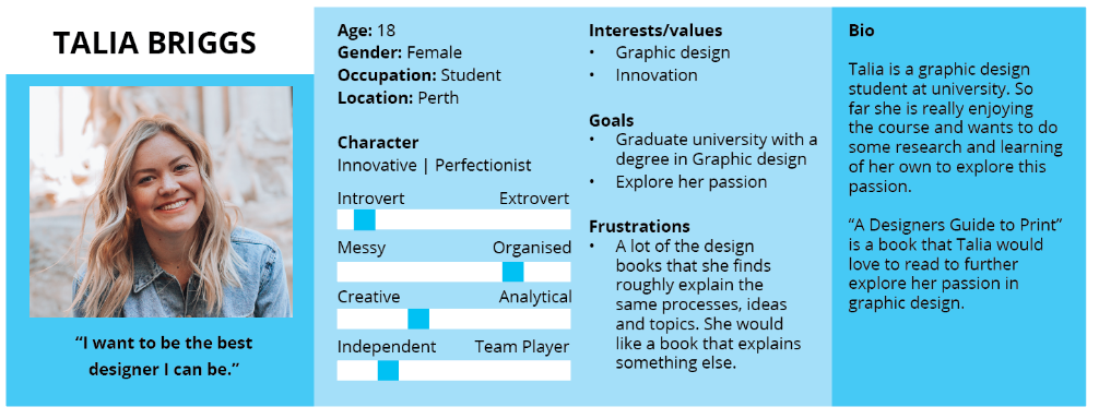
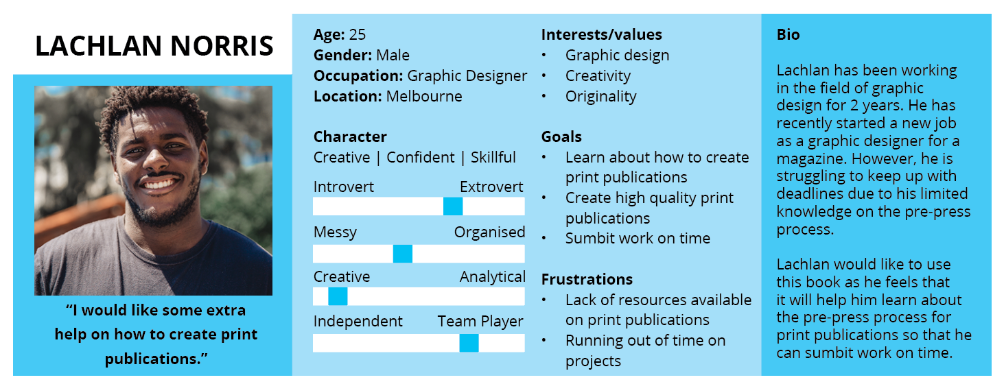
I first thought about who I am designing this publication for by using personas. I decided that the target audience will focus on are newly graduated graphic designers who are entering the workforce or have been in the workforce for a couple of years. I also kept in mind graphic design students at University or TAFE. The majority of this target audience were in their late teens to early twenties, with the odd person being older.

2. COMPETITOR ANALYSIS

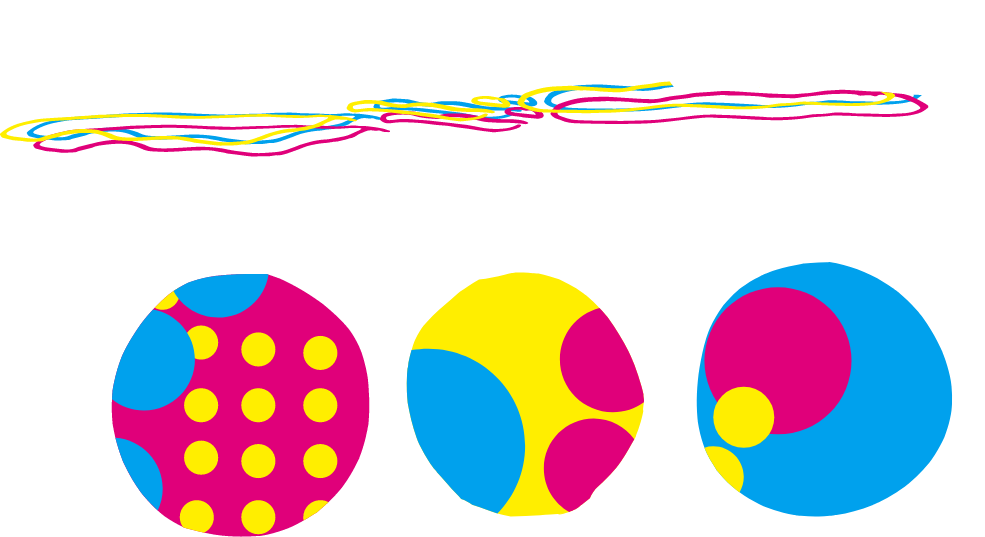
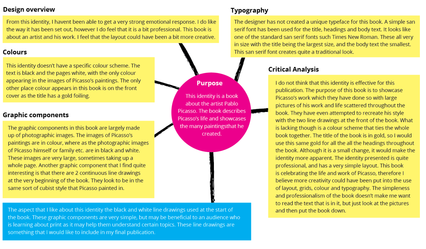
I completed a competitor analysis of different publications to see what other identities did well and what they could improve on. The findings from these helped to shape my final design. I found that graphic components may be beneficial to an audience who is learning a new skill or topic, and that using bright colours is beneficial, especially on the front cover to capture the viewers eye, and in different chapters as a way to separate the different topics within one book.

COMPETITOR ANALYSIS 1 - THE WORLD OF PICASSO

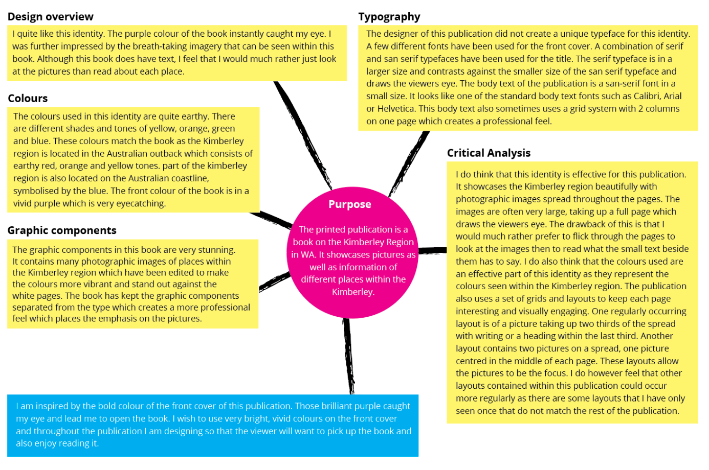
COMPETITOR ANALYSIS 2 - THE KIMBERLY

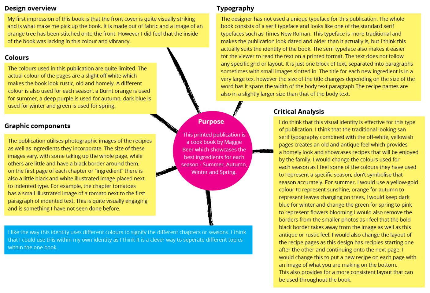
COMPETITOR ANALYSIS 3 - MAGGIES HARVEST

VISUAL INVESTIGATION

The visual investigation stage includes creating mind maps to help generate ideas for the development stage. During this stage, I also look at images, websites and other content found on the internet, as well as objects, books and other materials found in my surroundings to find inspiration.

1. BRAINSTORM

I made and continued to add to a brainstorm that outlined my ideas for the publication I was making. I decided to focus on these ideas when commencing the visual investigation. I was really inspired by bright colours and gradients as I wanted to make this publication stand out. Since this was a print publication, I thought the theme of ‘ink’ would be appropriate and therefore gathered many images of ink splats as well as type that had been written in ink. I also gathered some images of line drawings as this is the style that I wanted to incorporate.

I was also inspired by the work of David Carson. David Carson is a graphic designer whose messy, chaotic work stands out as he ignores basic design principles such as grids and typography. I liked his style as it looks raw and collaged. I thought that applying this raw style to a book about print publications would create an interesting look and be engaging for the viewer.

DEVELOPMENT

The Development stage includes creating rough sketches and refining them with computer software, as well as experimenting with different elements such as colour, grids, layouts, typography and images until an identity is created.

I did lots of experimentation with typography by physically painting words and letters. I wanted the typography to be raw and looked as if it have been drawn in ink by hand. I experimented using drips, splats, capitals, and cursive writing to create this raw and rough feel. I then converted these into a vector image using tools on illustrator.

I realised that this ink typography would not suit all pages so I needed an alternative heading font for these pages. I wanted something that was Bold and thick to suit the boldness of the ink typography. I chose the font Paralucent in a bold weight and capital letters. I liked the straight edges as it made the font neat and it stood out against the messiness of the ink splat designs and the CMYK dots.

For the body text and subheadings, I wanted something simple, modern, neat and easy to read due to the fact that the rest of the book may be a bit chaotic. After looking at different fonts, I chose the font Open Sans. It is small and has more rounded letters. Its a familiar font as it is used in many other publications.

2. COLOUR

I decided that for each of the different products, I would use a different colour for the packaging, to differentiate between them. I chose to use green for the tea tree cleanser, purple for the lavender moisturiser and a dark red for the natural rose-hip oil as these colours were present in these different plants.

3. GRAPHICS

Just like the typography, I experimented creating raw and hard drawn graphical components. I did not want to use photographic images, and instead wanted to use black and white sketchy illustrations to suit the dest of the identity. I again experimented with ink and dripping ink down the page.

The CMYK colour scheme overlaps CMYK dots and uses negative space to create the colours and images seen on the paper when printed. I thought I could represent this in a creative way and produce an exciting pattern that could be used on different pages within the final publication.

The grids created for the pages of this publication were quite simple due to other elements such as the typography and other graphic components being a bit chaotic. A simple grid allowed me to place text and graphics in a neat and oriented way and create a sense of cohesion.

I created 2 grids, a 3x3 grid and a 4x4 grid, both with gutters. Both were fitted to the margins to allow space around the pages to ensure text was not cut off.

4. LAYOUT

I wanted the layout of the pages to be simple and easy to follow because, as mentioned previously, the other elements such as the typography and graphical components are more messy. I wanted to incorporate a number of different templates or layouts so that each page was set out differently and the viewer did not lose interest. I wanted to keep the graphical components I made as the main focus and spread the text around these. Below are first iteration examples of what the pages looked like.

DELIVERABLES

The deliverables includes the delivery of the final outcomes, outputs, products or identities. These outputs should address the issues raised within the problem statement.

By combining all the visual elements such as colour, typography, grids, graphics and images, I started to create the final layouts for the publication. These layouts were eye catching and interesting which would help to keep the reader engaged. A coated paper with a matte finish was used when printing the book to help keep the graphics sharp due to the limited ink absorption. This along with the perfect binding created a professional look and feel, making the book seem like a reliable and trustworthy source of information. Being 34 pages long, this book aimed to help new designers understand the prepress process through fun graphics and captivating layouts.

2. TOUCHPOINTS

Three touchpoint, a black and white flyer, a bookmark and a brochure, were also created to help with the promotion of the book. Each touchpoint contained elements to help represent the theme of ink and printing. The brochure contains very similar patterns to what was seen In the book. The flyer contained 4 thick bold lines beneath the heading to represent the CMYK colour scheme. The bookmark contained overlapping ring like shapes that represented the CMYK colour wheel.

Next Project
BACK TO TOP