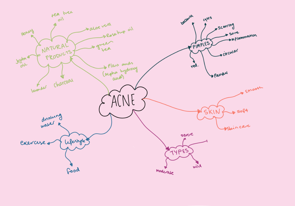
RESEARCH
The research stage includes defining the target audience and gaining a deeper understanding into the people affected by creating personas, empathy maps and conducting interviews. Competitors are also looked at to see what has been done in the past and whether or not these ideas have worked.
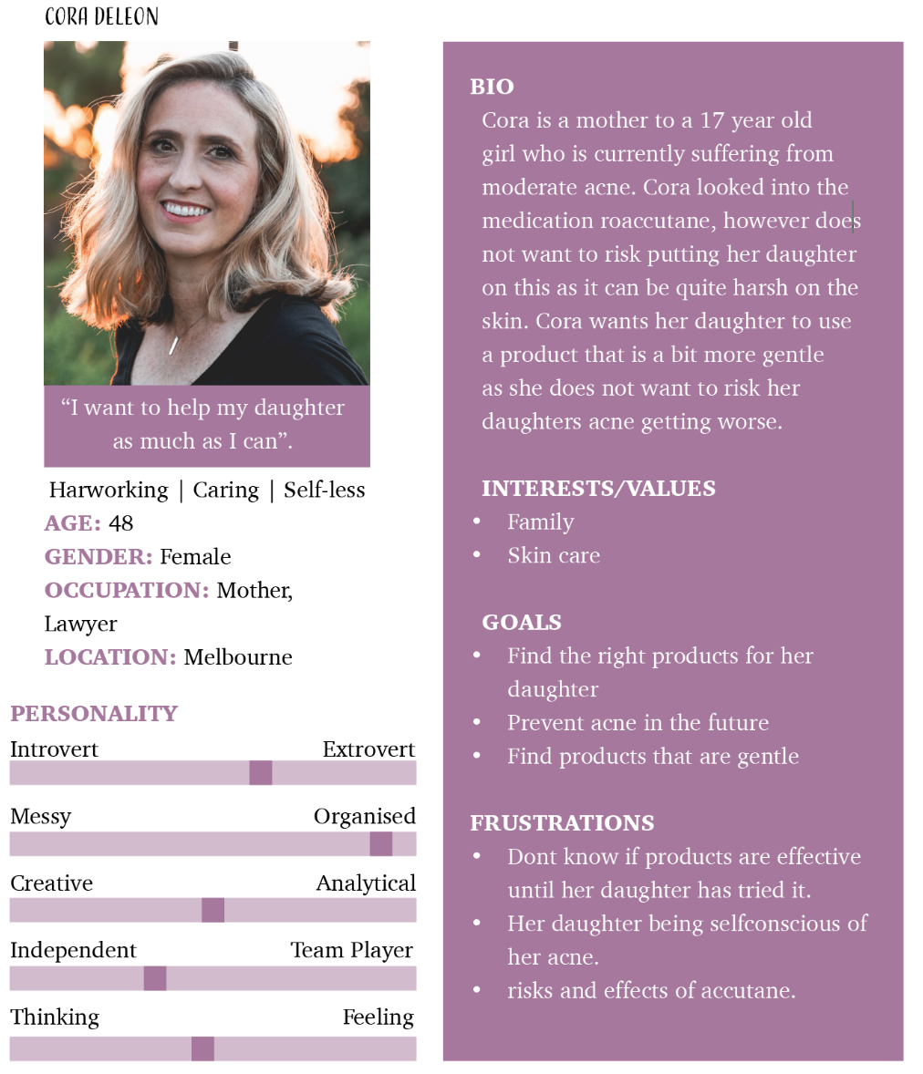
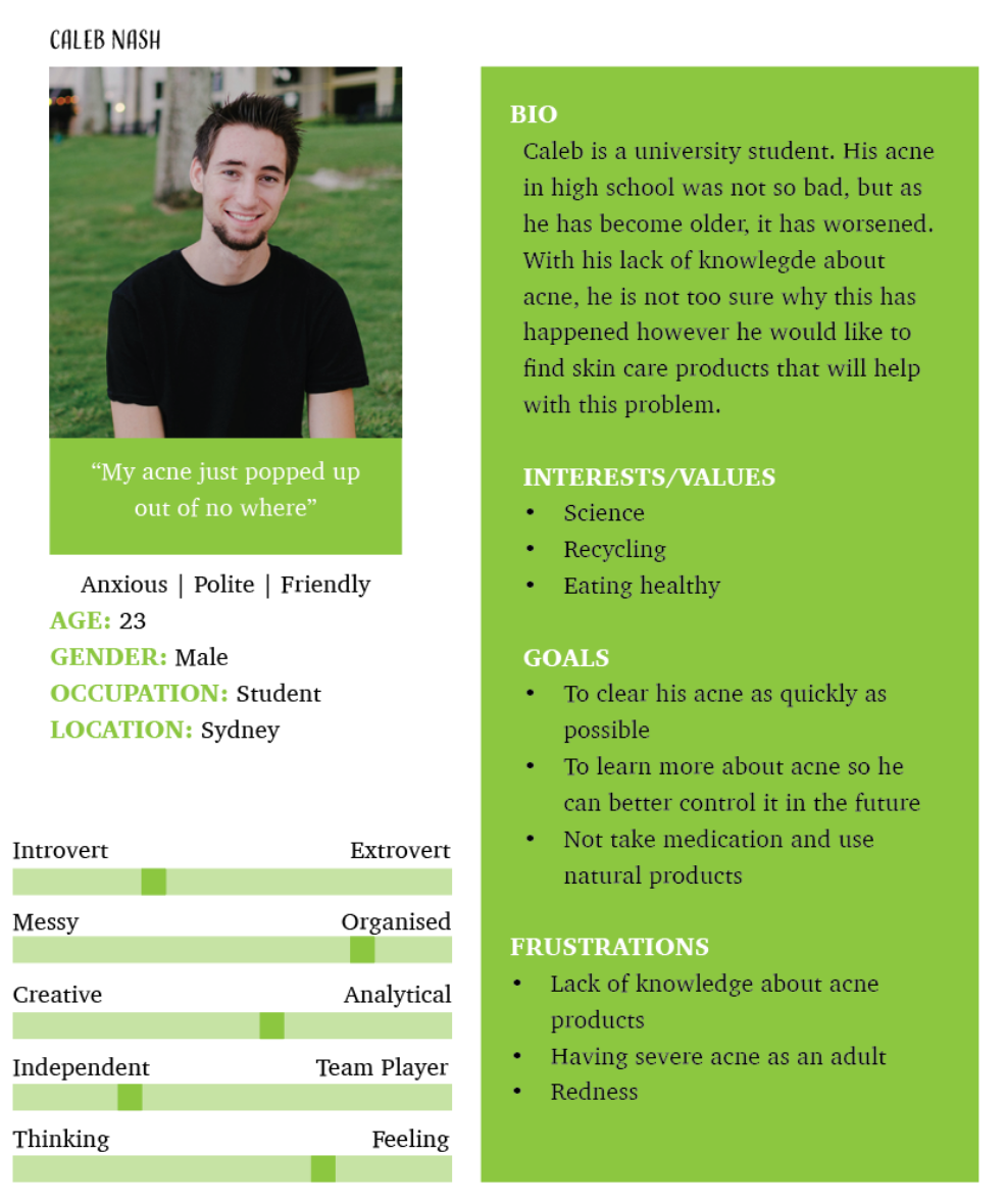
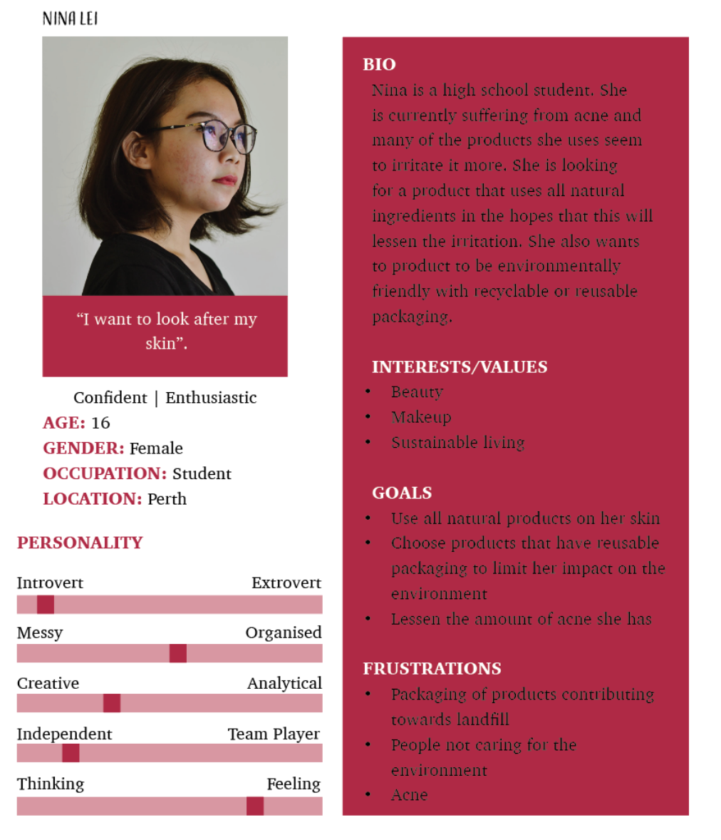
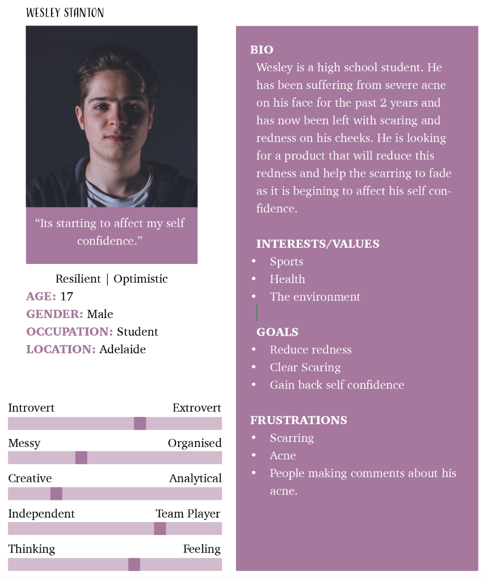
1. PERSONAS
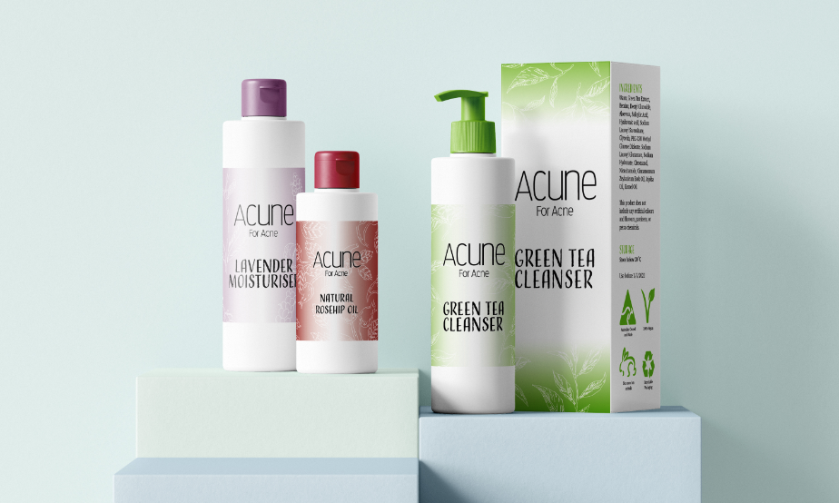
I started the development of personas. I decided to aim this product towards a younger target audience as acne mostly affects teenagers during puberty and young adults, as well as women during mensuration and menopause.
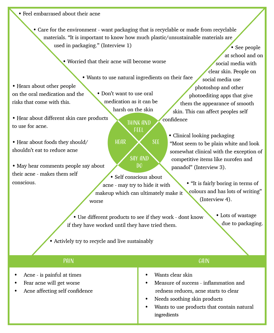
2. EMPATHY MAP
I interviewed many people about general pharmaceutical packaging. Questions I asked included:
- Is the way the packaging of a product looks important to you? Why/why not?
- When you buy a product, do you make sure that the packaging is recyclable?
- Do you think engaging pharmaceutical packing can improve the experience of going to a pharmacy?
- Do you have any suggestions for how to improve pharmaceutical packaging?
Interviewees agreed that pharmaceutical packaging was “a bit boring as it is completely white” (interview 5). However, interviewees believed that pharmaceutical packaging for prescribed medication did not need to be visually engaging.This was because “medication is chosen by function, rather than appearance” (Interview 1) and it is a necessity, so if people need it they will buy it anyway. For over the counter products however, there is more competition between brands so interviewees believed bright colours, large typography and graphics are more important so they can capture the viewers attention.
I created an empathy map based on the information I had collected.
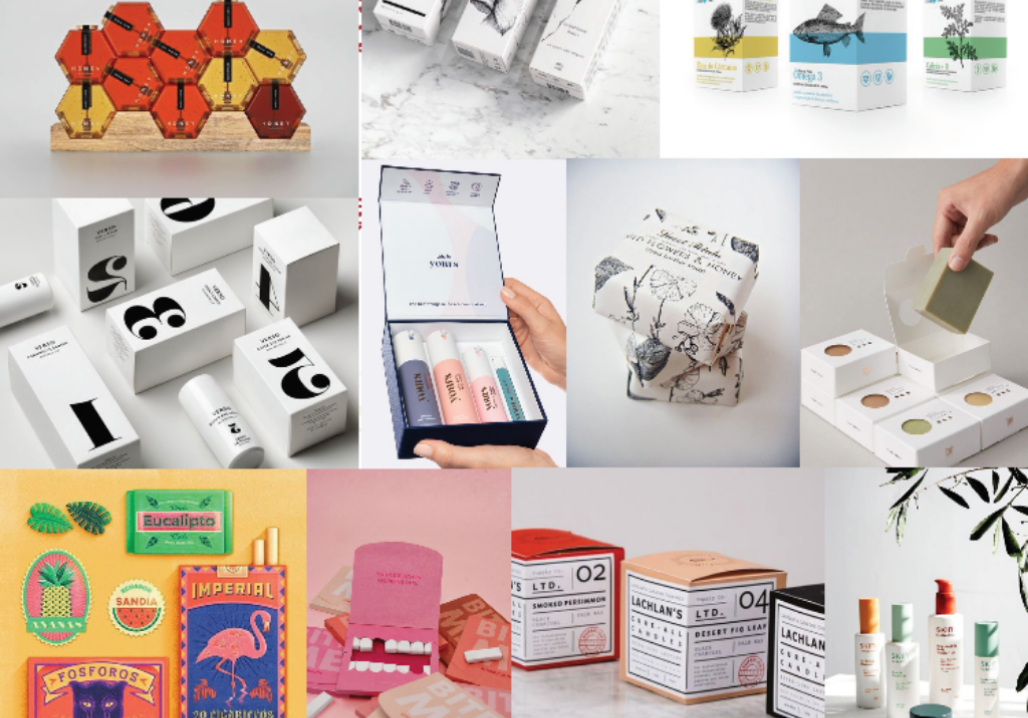
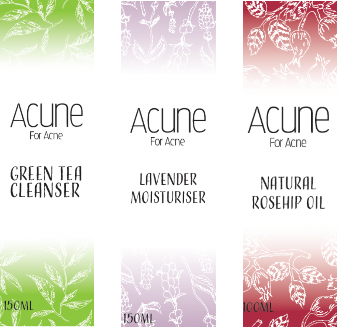
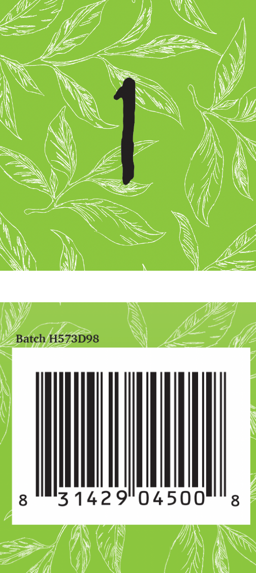
3. COMPETITOR ANALYSIS
A competitor analysis of similar products was conducted to see what other identities did well and what they could improve on. From these, I found that have an identifiable colour system and graphics in place would be helpful in capturing the viewers eye.
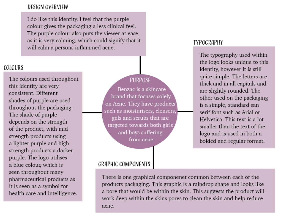
COMPETITOR ANALYSIS 1 - BENZAC
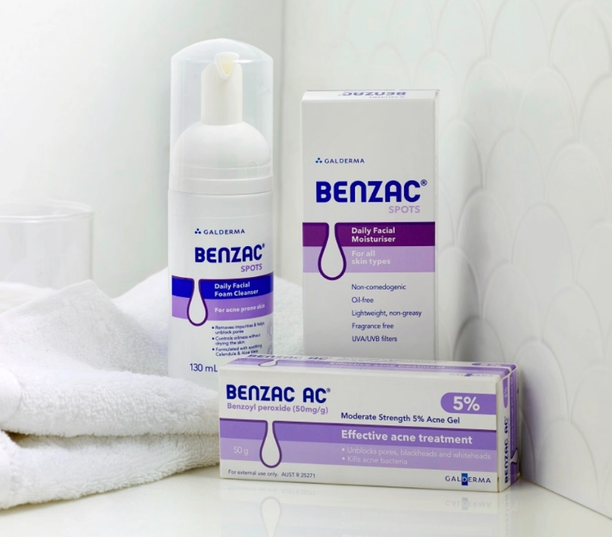
https://www.benzac.com/au
https://www.benzac.com/au
I do think that this identity is effective for the product. The different shades of purple allow for an easy process in identifying which products have a higher and lower concentration of the ingredient acrylates copolymer. There is one product however that contains a different colour, which is green. I am not sure why they have made this decision as the packaging does not match the rest of the packaging of the products within this identity, so I would change this to match the rest. The graphic also is a quick way to show the viewer how the product will work by cleaning deep within the skins pores.
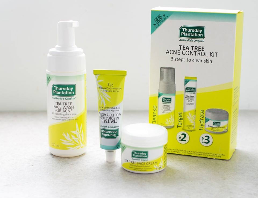
COMPETITOR ANALYSIS 2 - THURSDAY PLANTATION
https://www.facebook.com/ThursdayPlantationAustralia/posts/tea-tree-acne-control-kit-3-steps-to-clear-skin-now-in-1-handy-pack-including-te/2346589875351874/
I do think this identity and the packaging is effective for this product. The green environmental colours as well as the simple graphical components are successful in conveying the fact that these products contain natural oils that will help to clean and heal the skin. The typography also quickly and effectively shows the information to the audience such as what the product is and how to use the product. However the simpleness of the typography creates a quite professional and plain feel. I would change the typography in the logo to a more unique typeface that would stand out on the packaging.
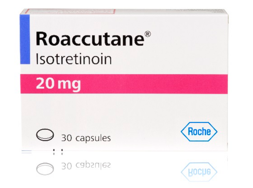
COMPETITOR ANALYSIS 3 - ROACCUTANE
https://www.roche.com/products/product-details.htm?productId=f36651ce-2625-4a13-8230-3ca0f511b417
https://www.roche.com/products/product-details.htm?productId=f36651ce-2625-4a13-8230-3ca0f511b417
I do think this product is effective in showing that it is a type of medicine as the packaging is very plain, professional and clinical. It would not however make me pick the packaging off the shelf as it would just blend in with all the other very clinical looking products that pharmacies. For that reason, this packaging is not effective in being engaging and visually interesting. I would change all aspects of this packaing. I would incorporate more colours and graphic images to try and fill up some of the white space. I would also change the text to be a slightly bigger size, but keep the same font to maintain a level of professionalism.
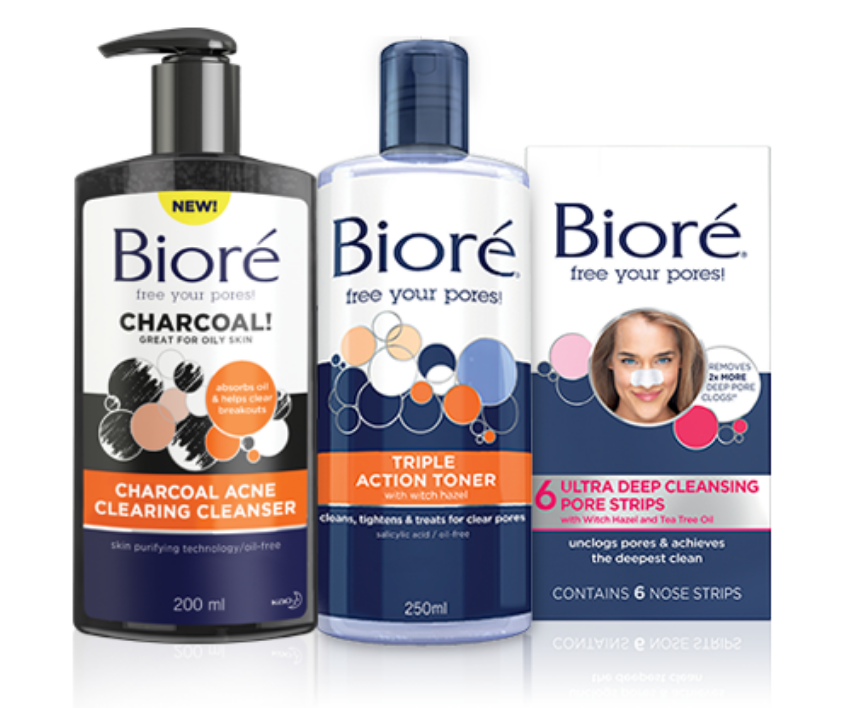
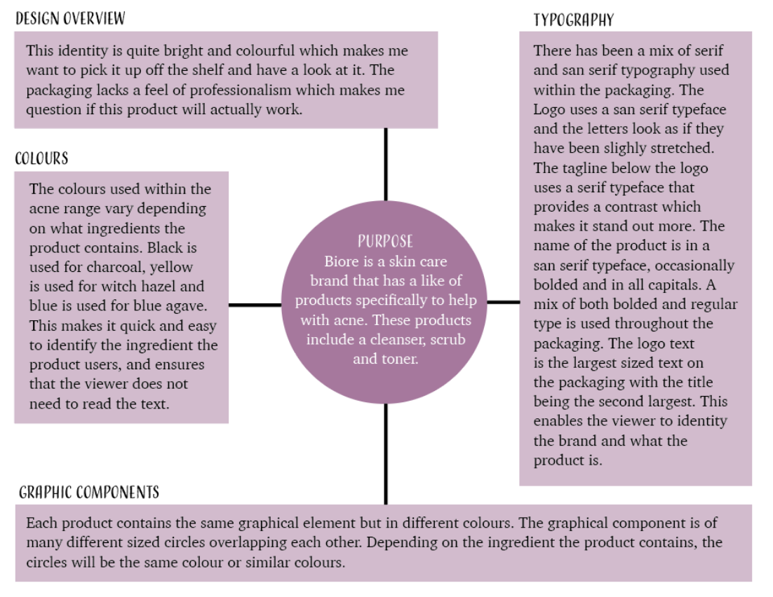
COMPETITOR ANALYSIS 4 - BIORE
https://www.biore.com/en-us/pore-care/
https://www.biore.com/en-us/pore-care/
I do think this identity is effective for this product. The graphics and typography are clear and to the point. I would however change the colouring of the packaging of the acne range. The colours used are all different depending on the ingredients the product contains, however I would make the colours used the same so that the viewer knows that these products are all part of the acne range and they do not have to read the text.