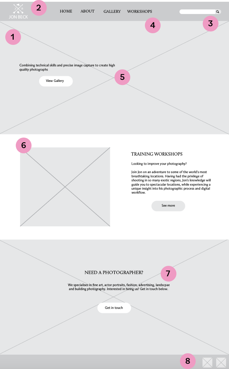
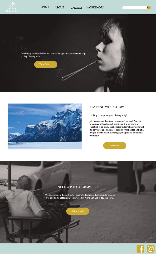
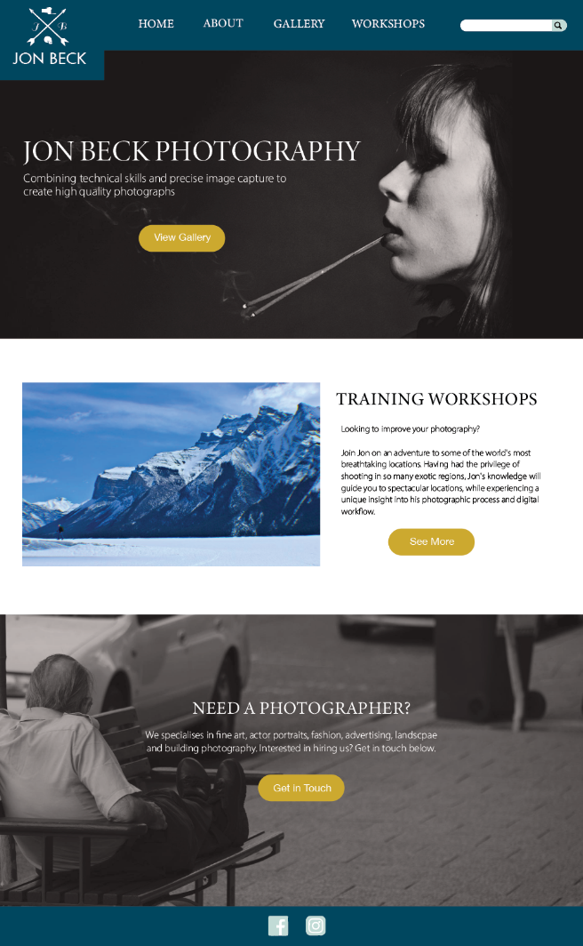
1. The homepage has been kept simple and split into different sections for each of the different goals.
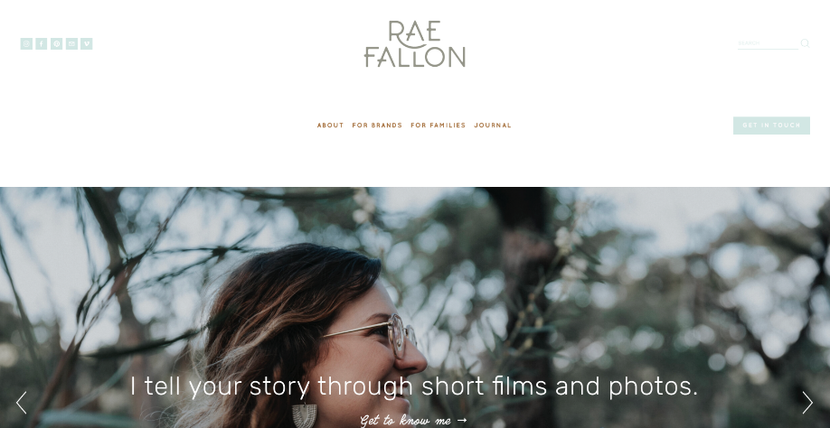
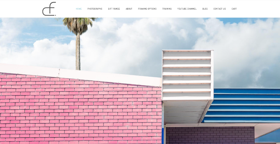
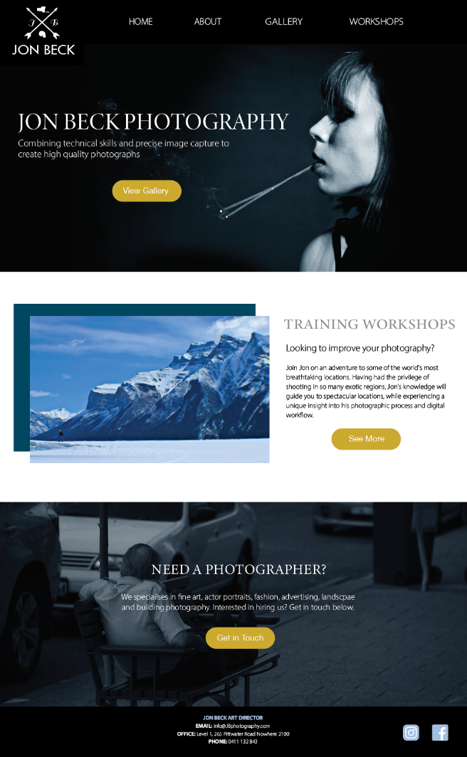
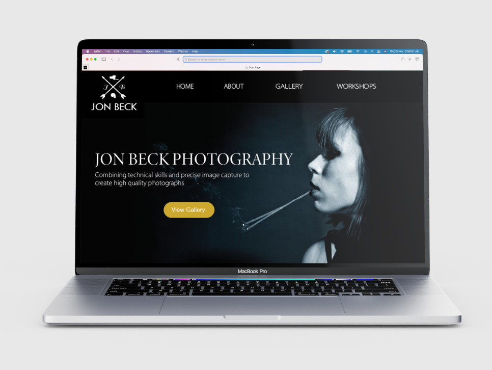
2. The logo was placed in the top left corner of the header so users know which website they have come to.
3. A search bar has also been placed in the top right corner of the header for users looking for specific information.
4. The main navigational links were placed within the header so that they could be easily accessed.
5. The large ‘hero’ image creates a focal point for the user, drawing their attention and leading them to the tagline and call to action taking the user to the gallery, which relates to the clients first goal of promoting work and selling photographs.
6. The second section of the homage related to goal two, promoting the training workshops, and section three directly related to goal three, hiring out the photographer.
7. These sections contain titles that are in a larger size and different font to the body text to ensure they stand out and the user can quickly find what they are looking for.
8. The footer contains links to the clients social media, providing other platforms for the user to view the photographers work.