FUTURISM - MURDOCH OPEN SHOWCASE

Branding | Publication design | Service design

WHAT IS IT?

The Murdoch Open Showcase is the end of year showcase held at Murdoch University displaying work from students enrolled in Creative Media Disciplines with the addition of Theatre and Strategic communications. This showcase is designed by both the students and staff as part of the service design unit. This is an important event for not only Murdoch University, but also the students as it allows them to exhibit their skills and projects to local industry, high schools, other students and the general public. I was part of the design team for the showcase in 2020 where we came up with the theme of ‘Futurism’, being hopeful for the future and using our design skills to create and contribute to a better future.

RESEARCH

The research stage includes defining the target audience and gaining a deeper understanding into the people affected by creating personas, empathy maps and conducting interviews. Competitors are also looked at to see what has been done in the past and whether or not these ideas have worked.
1.STAKEHOLDERS

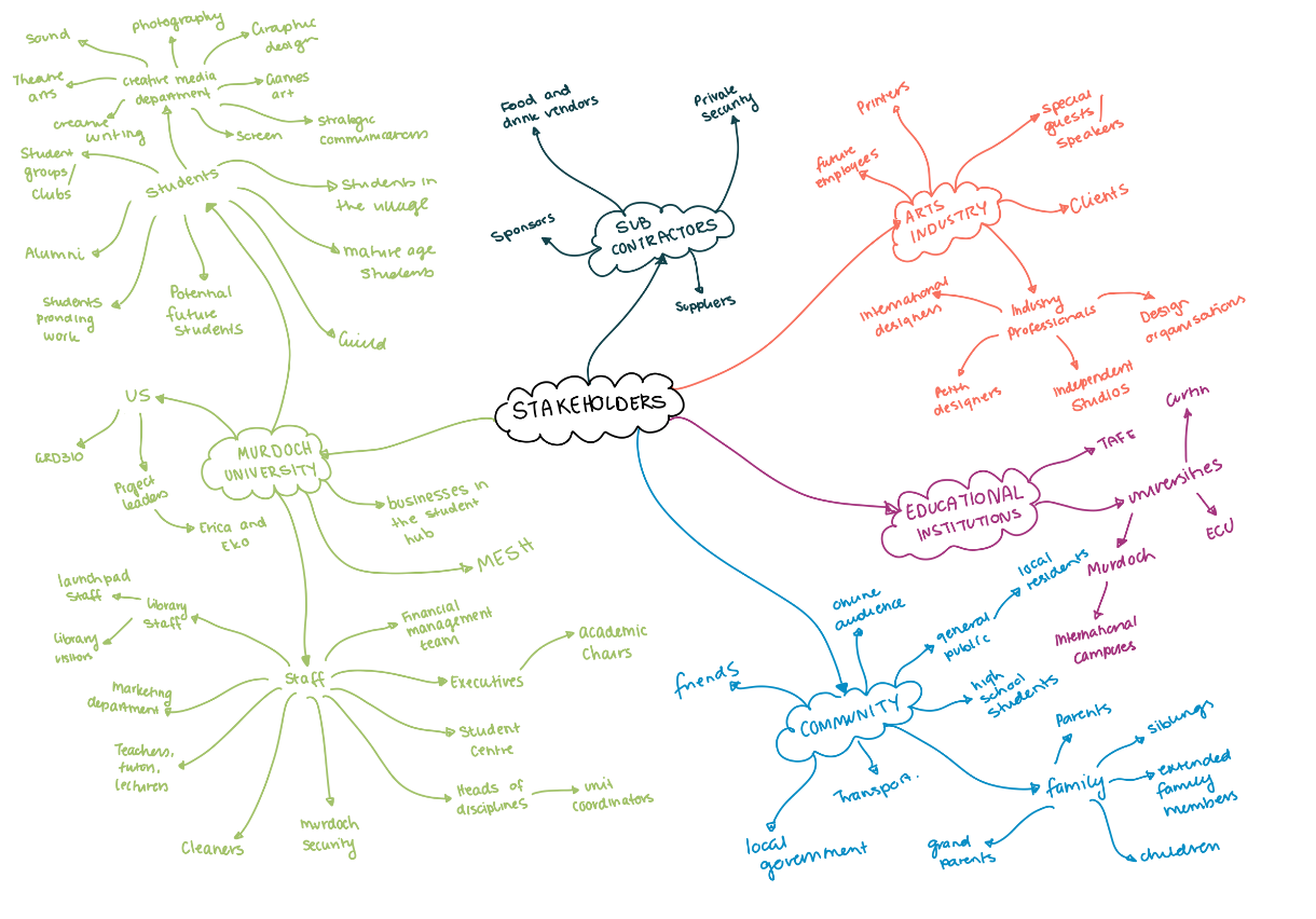
To begin the research for this massive project, we looked at the major stakeholders and created a stakeholder map to help determine who would be affected by or invested in this showcase. The main stakeholders for this event included current and future students, industry professional and Murdoch University representatives and alumni.

2. EMPATHY MAP

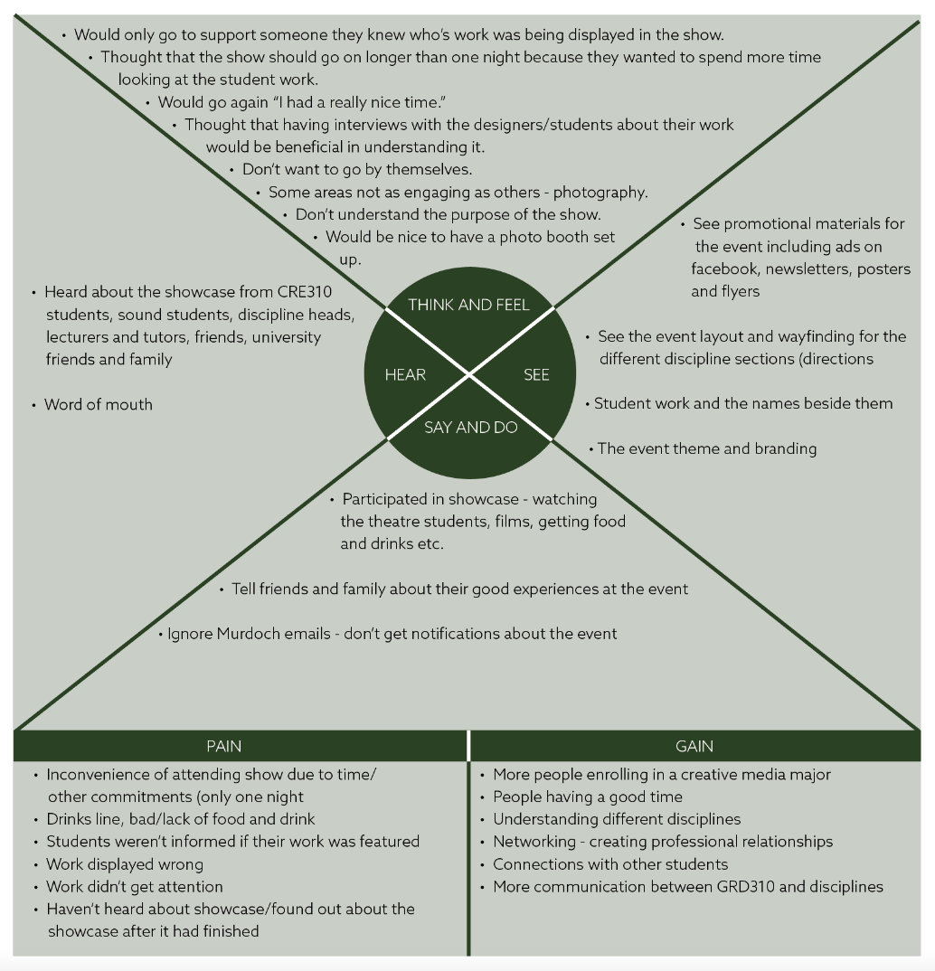
We began to brainstorm interview questions to ask Murdoch University students, as well as the general public about events and the showcase. Some of these questions included:

  1. Have you heard about the Murdoch Showcase?
  2. Have you been to the showcase? Why/why not
  3. What was your experience like?
  4. What did you most dislike or like about it?
  5. Do you the showcase could be improved? How?
  6. Would you go again? Why/why not.

From these many interviews conducted we found lots of valuable research which I turned into an empathy map.
3. JOURNEY MAP

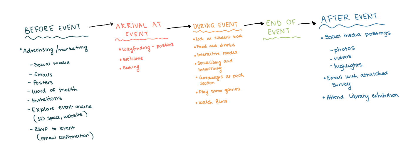
To continue our research into the audience, we looked at journey mapping, and the journey the user takes before, during and after an event and what touch points they may come across.

3. JOURNEY MAP

To continue our research into the audience, we looked at journey mapping, and the journey the user takes before, during and after an event and what touch points they may come across.
VISUAL INVESTIGATION

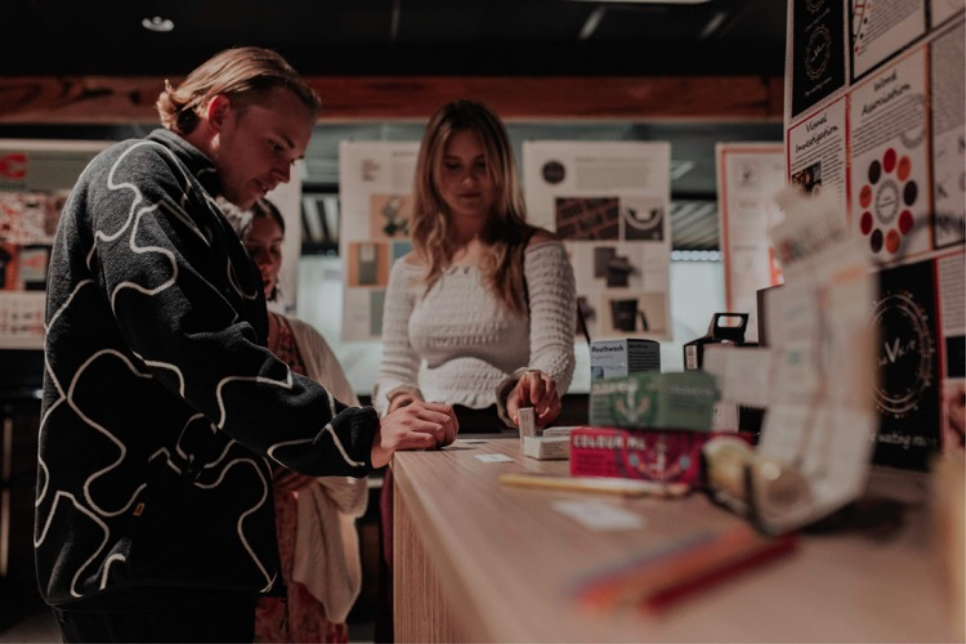
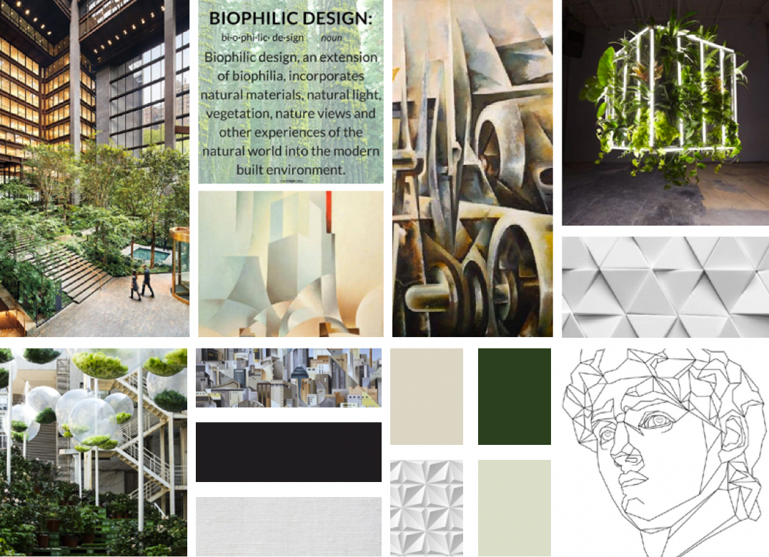
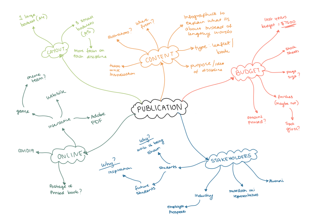
The visual investigation stage includes creating mind maps to help generate ideas for the development stage. During this stage, I also look at images, websites and other content found on the internet, as well as objects, books and other materials found in my surroundings to find inspiration.

BRANDING

1. THEME

With this research completed, we started to think of a theme for this years showcase. Each discipline group came up with a different theme such as behind the scenes or behind closed doors and retro future or futurism. We each voted for our favourite with the winning theme being futurism, the main idea behind it being about haven hope and optimism for the future.

2. VISUAL INVESTIGATION

Research into this idea of futurism began by looking at past futurist movements. As a group, we decided we would take influence from all different movements and aesthetics of futurism to create our own version of futurism. We were then faced with the challenge of how do we visually represent this new version of futurism with out ideas of the future including optimism, peace, sustainability and innovative technology. A visual investigation was conducted to help us fine-tune our idea of futurism.

PUBLICATION

1. BRAINSTORM

Being assigned to the publication team, we had the responsibility to create the publication that would contain the images and descriptions of all the student work that was to be showcased. We first started with a brainstorm, focusing on the various ways we could go about making the publication and the possibilities that it could take. We wanted the publication to not only promote students as creators and be a portfolio, but also to serve as an inspiration for future students. We had the idea of splitting the publication into eight different booklets to allow more focus on each discipline, and that way, visitors to the event could take a booklet from each different section they were interested in.

2. VISUAL INVESTIGATION

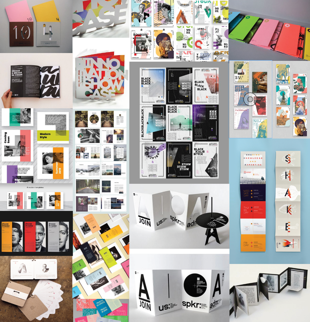
A visual investigation into publications was conducted to help us find inspiration that gave us a broad sense of what we wanted to design.

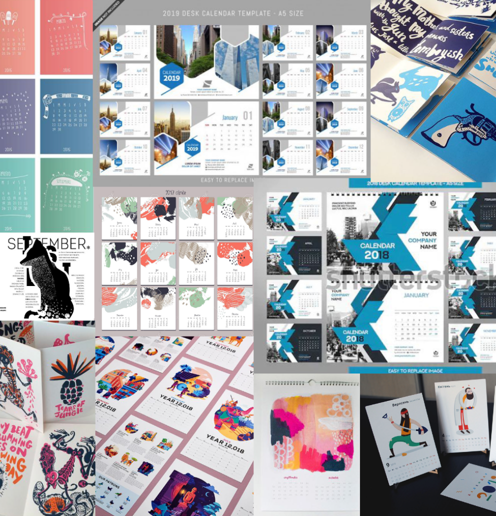
However issues started to arise with the budget and it was announced that creating a large publication for the event was not possible anymore. Because of this we were back at our investigation stage, brainstorming cheap and effective ways in which we could display student work. We instead started to look at the idea of a large paper pad in which you could rip off pages. This idea reminded us of a calendar and it was then decided that the publication would double as a square calendar that could be hung up as a way for people to look forward towards their future. As there are 12 months in a year, it was confirmed there would be 12 sections, 8 of them being the disciplines. As the layout for the publication had changed again, more images were compiled into a visual investigation to help generate ideas for ways in which we could lay out the calendar.

Visual Investigation 1

Visual Investigation 2

DEVELOPMENT

The Development stage includes creating rough sketches and refining them with computer software, as well as experimenting with different elements such as colour, grids, layouts, typography and images until an identity is created.

BRANDING

1. COLOUR

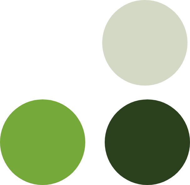
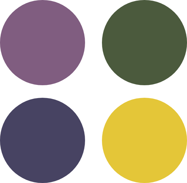
The colours chosen for the brand included a variety of greens ranging from light to dark. These green colours helped to convey an environmental feel and were colours that helped to represent optimism, positivity and hope.

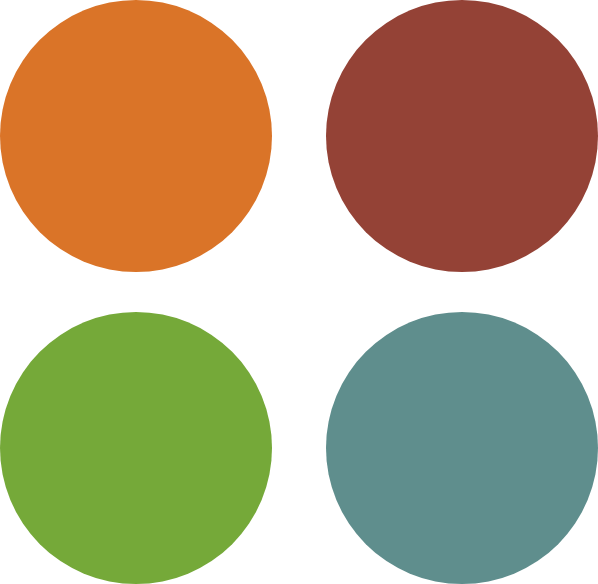
Another colour scheme was developed and specific to the different disciplines. Each discipline was given a different colour as a way to identify them, These colours would be used specifically in the way finding posters and the publication to seperate each section.

Primary colour scheme

Secondary colour scheme

2. GRAPHICS

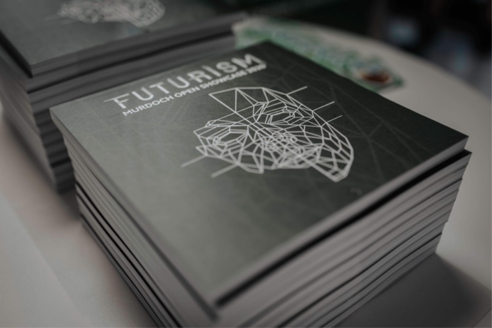
Origami and geometric shapes were quickly becoming main components of the branding, symbolic of the unfolding and revealing of our future. The mask was quickly becoming the face of the brand and was present on the website, social media, posters, flyers and other promotional materials being made.

Along with the alternate colour scheme to go with the disciplines, geometric icons were made to represent each discipline. These icons were to be used within the website and the publication.

PUBLICATION

1. LAYOUTS

THE CALENDAR PAGES

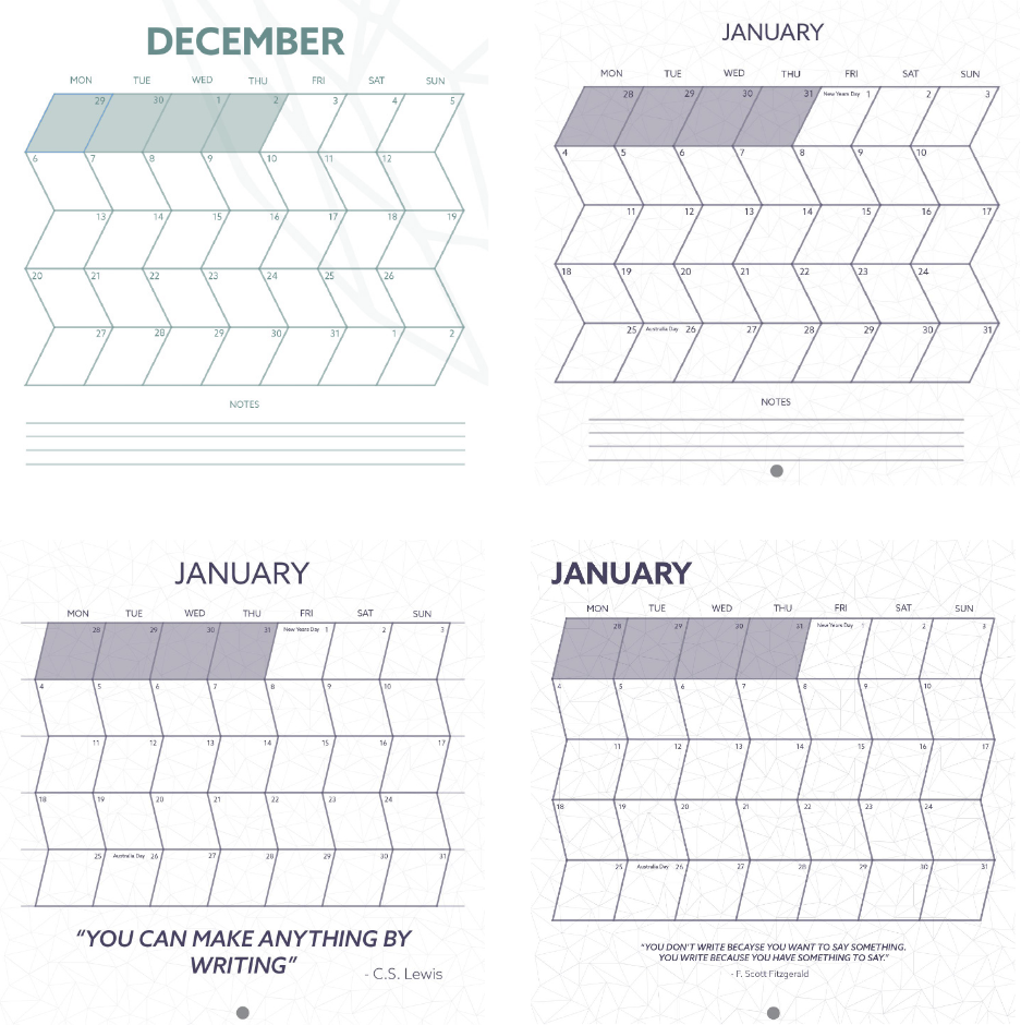
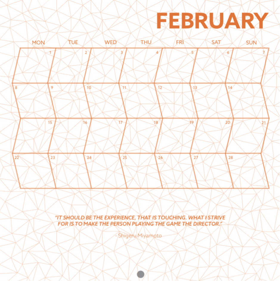
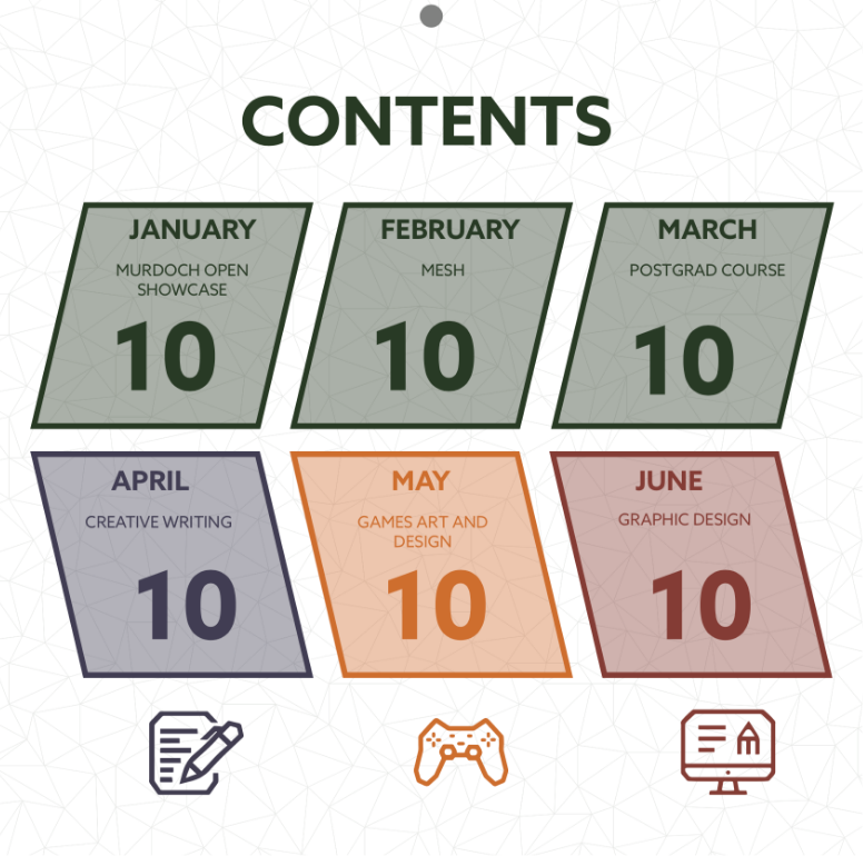
For the calendar aspect of the publication, we thought that having the calendar on only the first page of each section would be best, so we would still have lots of room to showcase student work. I decided to work on these calendar spreads as I already had an idea of what they should look like. I created the calendar in a rhombus, zigzag angular shape to match the branding. I felt the calendar needed something in the background to be more visually engaging so I experimented with different geometric shapes and isometric designs. Quotes that related to each discipline were also used on each calendar page. Below are progress shots of how I got to the final calendar spread.

Final calendar layout

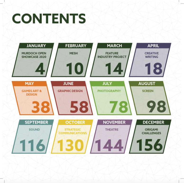
THE CONTENTS PAGE

I also designed the contents page, utilising the same rhombus shape and isometric design to create consistency.

Final contents layout

DELIVERABLES

The deliverables includes the delivery of the final outcomes, outputs, products or identities. These outputs should address the issues raised within the problem statement.

1. THE SHOWCASE

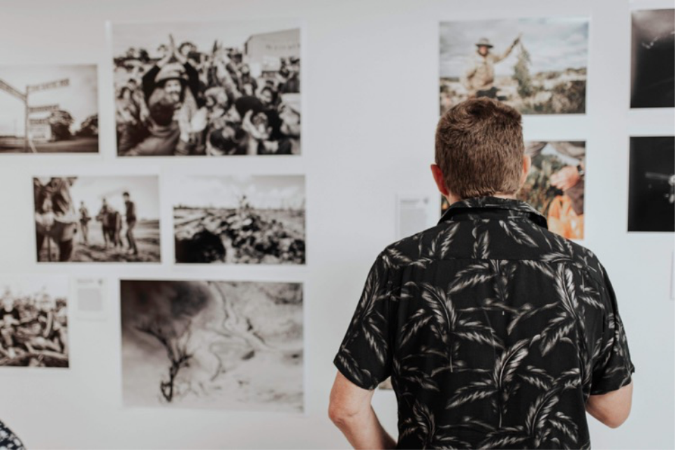
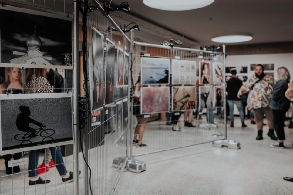
I think that the show was quite successful. It was very well attended with tickets being sold out online. It was also quite informative, which is something that we aimed for at the start, to inform others of what the creative media degrees are about and what they include. The event also ran smoothly with the speeches, performances and films being played. After the showcase, an exhibition was set up in the library for a longer period of time, to allow those, who didn’t go to the showcase, to view the student work.

2. THE PUBLICATION

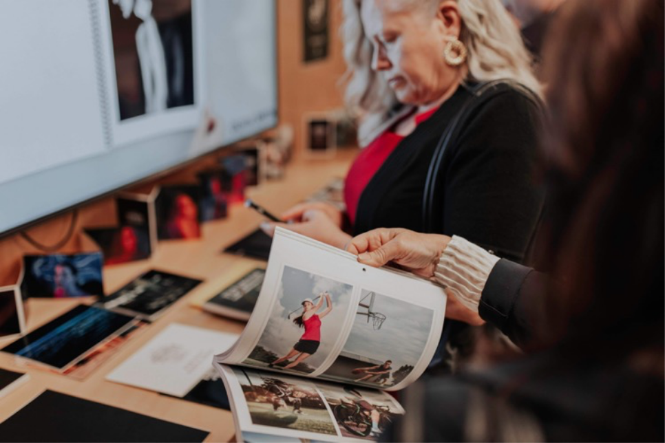
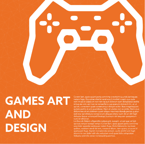
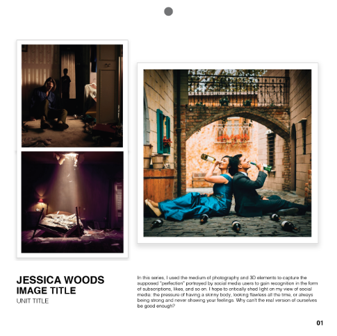
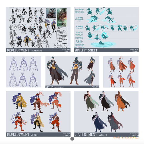
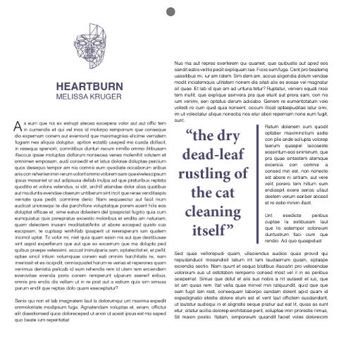
The publication was well received with lots of people taking one. We displayed student work effectively and in a way that was engaging. Below are some of the other pages created by my other team members.

3. THE WEBSITE

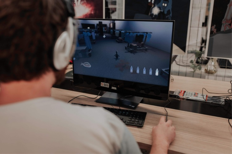
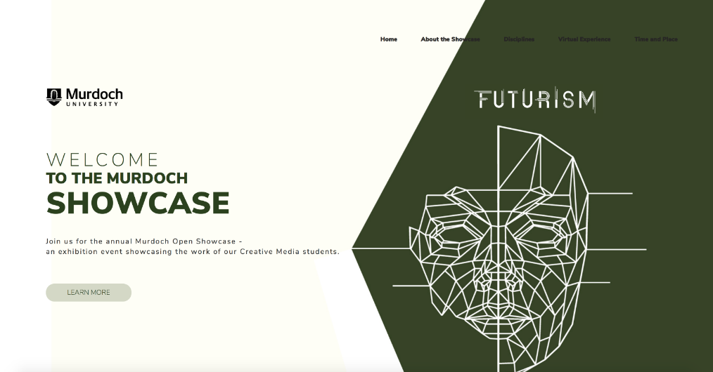
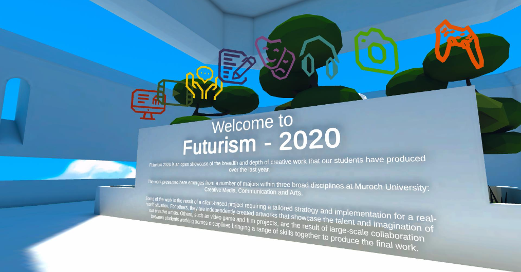
The website was the output created by the online team. This space acts almost as a digital publication as it contains all the student work from the showcase. The online team also created a 3D virtual experience in which people can attend the showcase from home. This virtual experience enables the user to walk around into different rooms and view the student work. This is beneficial as the showcase is only one night, so will allow people to access the student work even after the showcase finished.

Next Project
BACK TO TOP