MAKING INFORMATION EASY TO FIND WITH THE NEW FREMANTLE ARTS CENTRE MICROSITE
Branding | Website design | Website development
RESEARCH
The research stage includes defining the target audience and gaining a deeper understanding into the people affected by creating personas, empathy maps and conducting interviews. Competitors are also looked at to see what has been done in the past and whether or not these ideas have worked.
1. THE TARGET AUDIENCE
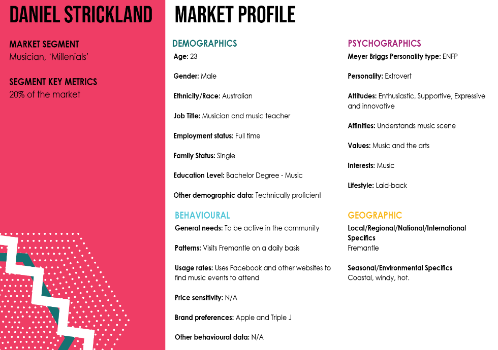
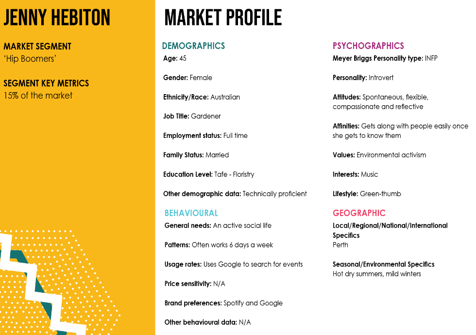
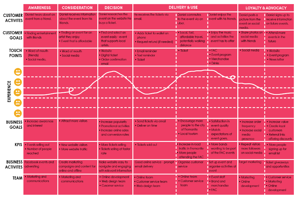
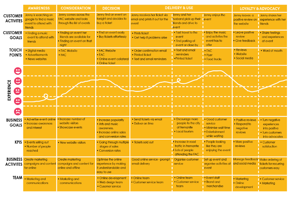
To first understand what this new site needed to communicate, I needed to understand the goals of the users, and their reasons for using this new website. In quick design sprints with the client and a larger team of designers, we identified target audience as being quite broad, as the FAC has a very varied range of music events. It was narrowed down to millennials and ‘hip’ boomers with an interest in music and attending music events. Market profiles, personas and user journeys were created to for an in-depth look into the target audience and later allowed me to adapt the content and look and feel of the website, to ensure a maximised user experience.
MARKET PROFILE
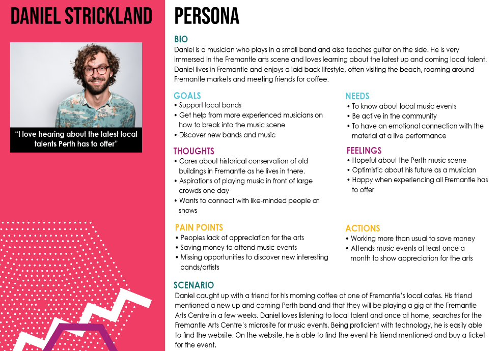
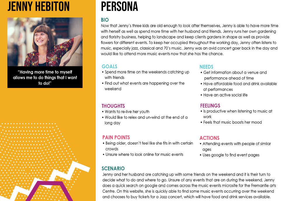
PERSONA
JOURNEY MAP
2. COMPETITOR ANALYSIS
I undertook a competitor analysis of two similar websites that advertise and sell tickets to events. Within these websites, I was able to identify positive aspects to be used, as well as negative aspects to avoid. Some aspects that I would like to include in my own design include keeping the homepage simple and utilising different visual elements to capture the users attention.
COMPETITOR ANALYSIS 1 - MOSHTIX
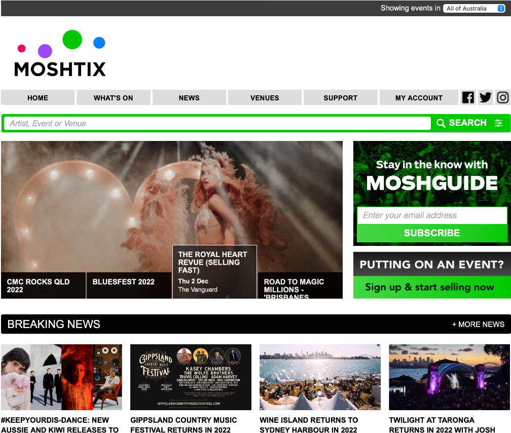
https://www.moshtix.com.au/v2/
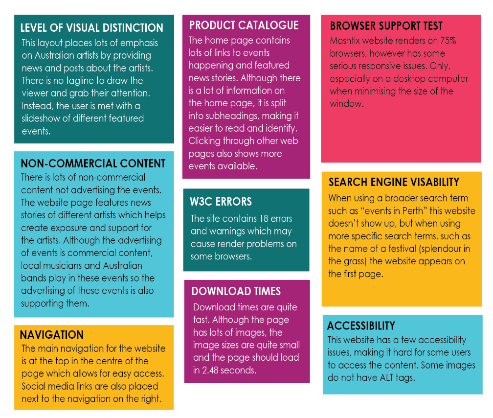
This website places a large focus on the artist, instead of the visuals. Although the content is important, visuals are also important as they help draw the user into the website. This website uses lots of white space and relies on the content to grab the users attention. Although there is no tagline, a bright green colour is used to attract the user to important aspects such as the search button or subscribing to the Moshguide newsletter. The design is welcoming the homepage is full of information, inviting the user to read the content. I think this website would attract younger millenials wanting to quickly find information and buy tickets.
Some design decisions I would like to make to the FAC’s website based on this competitor analysis are to use visual elements such as colours, shapes and movement to attract and grab the users attention. Make clear headings for each section of the homepage so the user knows what the content is.
COMPETITOR ANALYSIS 2 - RAC ARENA
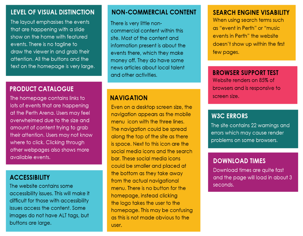
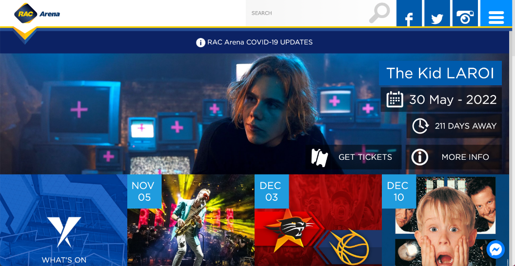
https://www.racarena.com.au
This website places a large focus on the events at the Perth arena. The large buttons and differences in use of text, such as uppercase and lowercase, make the website look unprofessional and disordered. There is lots of content on the front page all fighting for the users attention. However I do feel that these large buttons may attract an older target audience, which is why they may be there. The colour scheme consists of mostly blue which doesn’t allow different elements to stand out. This website is lacking a tagline and call to action button that would draw the viewer into the site.
Some design decisions I would like to make to the FAC’s website based on this competitor analysis are to keep the homepage quite simple with limited content. This is so users are not overwhelmed and can click the content they want to view, rather than viewing all of it. I will also make sure to include a tagline and call to action button to draw the user in and establish a focal point.
VISUAL INVESTIGATION
The visual investigation stage includes creating mind maps to help generate ideas for the development stage. During this stage, I also look at images, websites and other content found on the internet, as well as objects, books and other materials found in my surroundings to find inspiration.
1. VISUAL INVESTIGATION
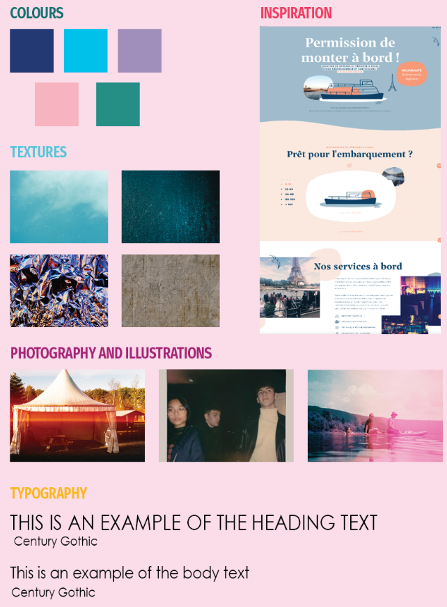
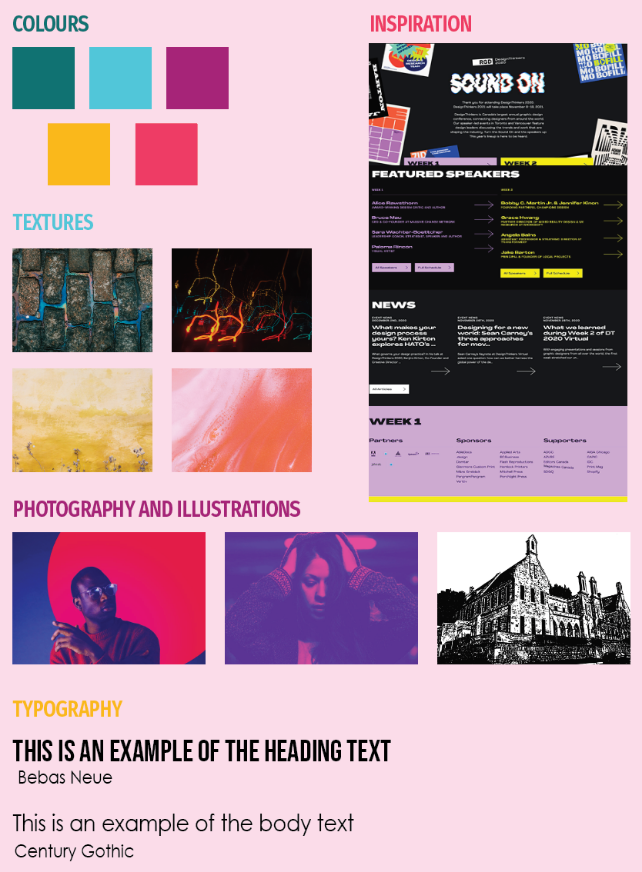
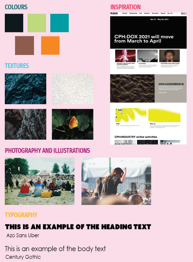
I then started to look at the visuals of the website and created three different visual investigations to give an idea of what the basic look and feel of the website may look like. The chosen theme was labelled as ‘contemporary’ which combined visual elements in a unique and interesting way. A broad range of bright colours were chosen as they hint at Australia’s diverse culture. The geometric font Century gothic was chosen for the purpose of reflecting the historic gothic building and traditions of the Fremantle Arts Centre. The client also liked features from the other visual investigations such as the use of imagery, so some features of each visual investigation were combined to create the desired direction that will help to attract the target demographic.
CULTURED
CONTEMPORARY
UNIQUE
DEVELOPMENT
The Development stage includes creating rough sketches and refining them with computer software, as well as experimenting with different elements such as colour, grids, layouts, typography and images until an identity is created.
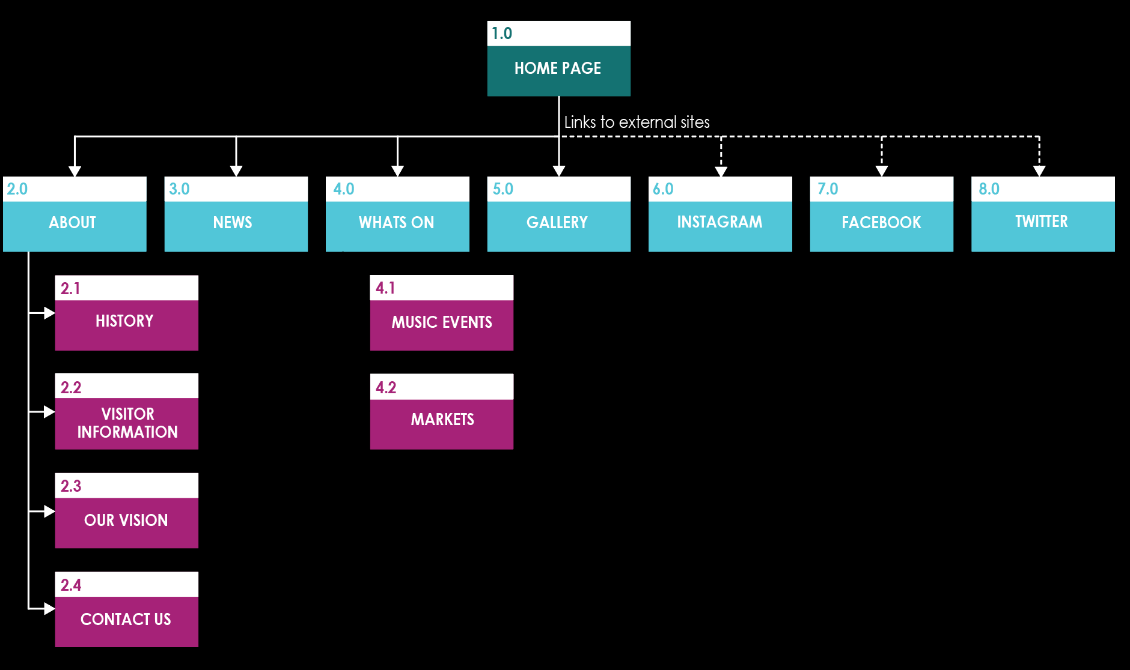
1. SITE MAP
A site map was created to help figure out the different web pages that were going to be present within this website. The main navigational links for this website were kept quite simple with four main links leading from the homepage, some of which had sub-links. Links to external social networking sites were also included to provide users with another way to access information.
2. WIREFRAMES
With the basic research completed, content collected and lo-fi sketches of the layout completed, I moved onto wireframes and creating the layouts for the the homepage, news page and events page. These layouts were created using adobe XD, showing how the pages may look of different devices including computers, tablets and mobiles. These wireframes enabled me to focus on the content and create a structure that was easily readable and placed the content in a hierarchal manner. Although only the desktop view is shown, tablet and mobile views were also taken into consideration.
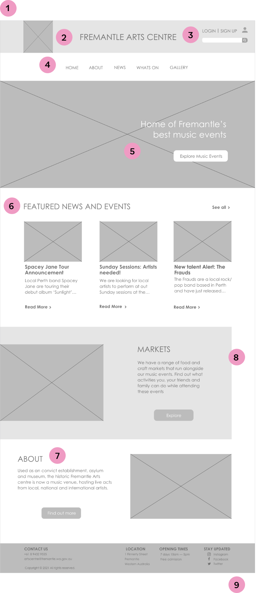
HOMEPAGE
1. The homepage has been kept simple with familiar elements seen on other webpages to attract a target audience of ‘hip boomers’ and millennials.
2. The logo along with the website name was placed at the top of the page so the user knew which website they were on.
3. A search bar was also placed in this header area for users looking for specific information, as well as login and signup buttons for users wanting to create an account.
4. The main navigational links were placed underneath the header so they could be easily accessed.
5. The large image created a focal point, drawing the users eye and leading them to the tagline and call to action, relating to the clients first goal of promoting the Fremantle Art’s Centres unique music and concert events.
6. Section two of the homepage containing the news articles directly related to the clients second of promoting and supporting local artists, and the third section called ‘markets’ directly related to goal three of promoting other activities that run alongside the music events.
7. Section four prompts the user to read more about the history of the building, which is important as historical influences from the building have been taken into account when I was looking at typography, colour, shapes and other visual elements.
8. Each of these sections had a large capitalised title so that it stood out and the user can quickly find what they were looking for.
9. The footer contained social media links and other important information such as contact details, location and opening times.
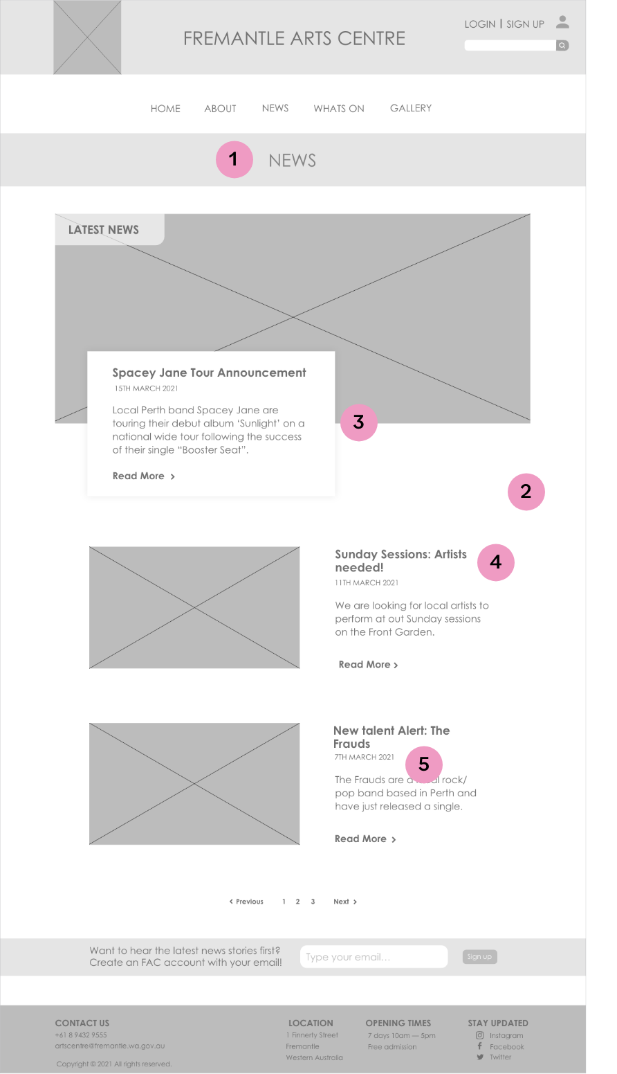
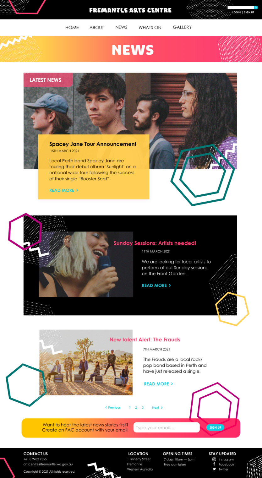
NEWS PAGE
1. The aim of the news page was to promote and support local artists.
2. A simple and familiar layout has been used for this page, with different articles placed beneath each other and are sorted by date.
3. The first news article captures the users attention as it has been placed within the first section of the webpage.
4. Article titles have been bolded and placed in a larger size than the body text.
5. The date has also been capitalised, and read more buttons have arrows next to them encouraging the user to click them.
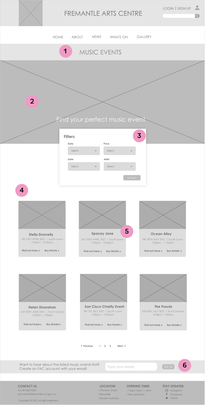
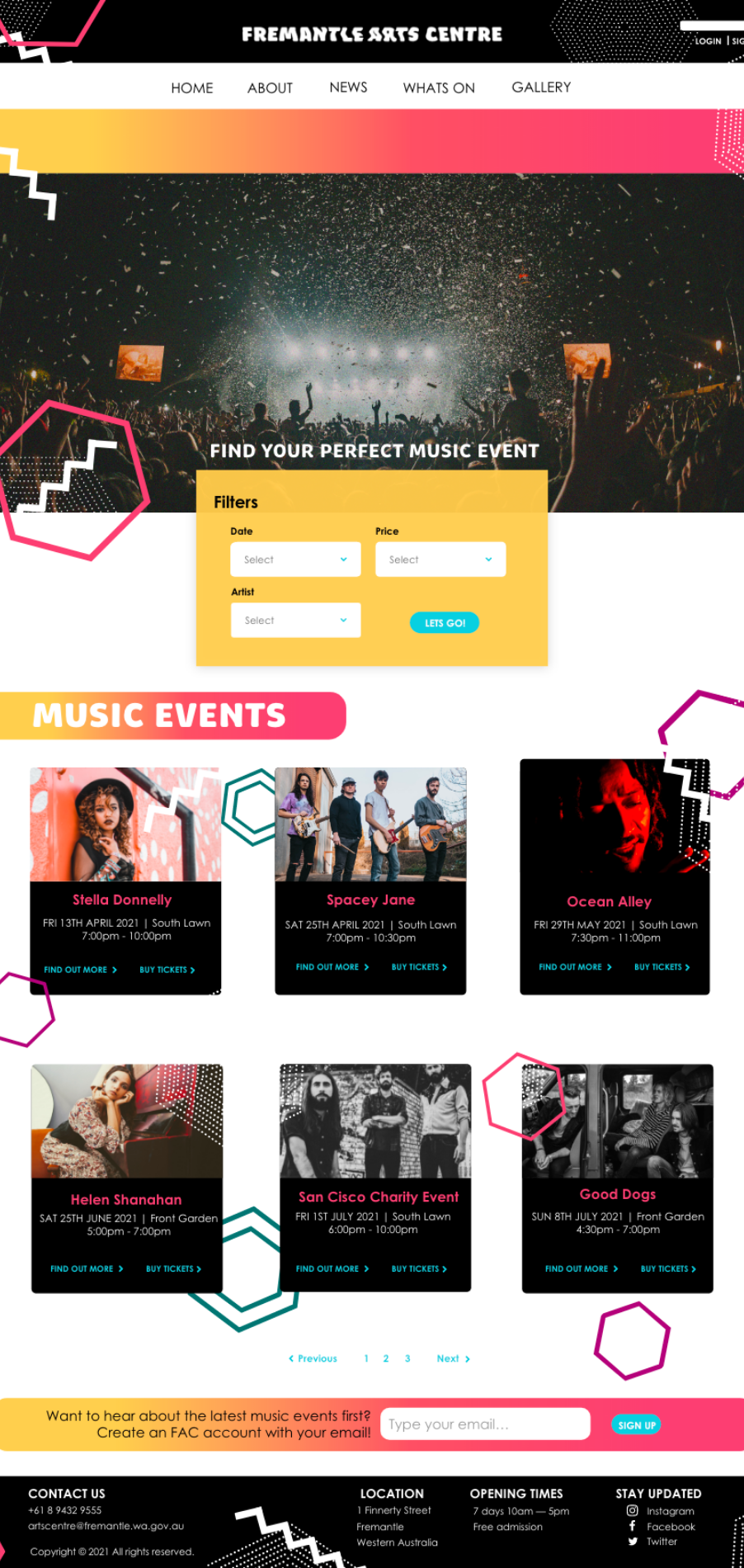
EVENTS PAGE
1.The aim of the events page was to promote the music events to be held at the Fremantle Arts centre.
2. The large image was used at the top of the page to create a focal point and draw the users attention, leading them to the filter section.
3. These filters would be convenient for the user as it would help them to narrow down events to ones that interest them.
4. The events themselves were placed in a simple 2 by 3 grid layout, ensuring the design stayed uncluttered and giving each event the same amount of visual prominence.
5. For each event, an image was placed at the top to draw the attention of the user and all the important information centre aligned underneath, with titles bolded and dates capitalised.
6. An email banner was also included towards the bottom of the page to encourage users to sign up for the newsletter.
HOMEPAGE
1. The homepage has been kept simple with familiar elements seen on other webpages to attract a target audience of ‘hip boomers’ and millennials.
2. The logo along with the website name was placed at the top of the page so the user knew which website they were on.
3. A search bar was also placed in this header area for users looking for specific information, as well as login and signup buttons for users wanting to create an account.
4. The main navigational links were placed underneath the header so they could be easily accessed.
5. The large image created a focal point, drawing the users eye and leading them to the tagline and call to action, relating to the clients first goal of promoting the Fremantle Art’s Centres unique music and concert events.
6. Section two of the homepage containing the news articles directly related to the clients second of promoting and supporting local artists, and the third section called ‘markets’ directly related to goal three of promoting other activities that run alongside the music events.
7. Section four prompts the user to read more about the history of the building, which is important as historical influences from the building have been taken into account when I was looking at typography, colour, shapes and other visual elements.
8. Each of these sections had a large capitalised title so that it stood out and the user can quickly find what they were looking for.
9. The footer contained social media links and other important information such as contact details, location and opening times.
NEWS PAGE
1. The aim of the news page was to promote and support local artists.
2. A simple and familiar layout has been used for this page, with different articles placed beneath each other and are sorted by date.
3. The first news article captures the users attention as it has been placed within the first section of the webpage.
4. Article titles have been bolded and placed in a larger size than the body text.
5. The date has also been capitalised, and read more buttons have arrows next to them encouraging the user to click them.
EVENTS PAGE
1.The aim of the events page was to promote the music events to be held at the Fremantle Arts centre.
2. The large image was used at the top of the page to create a focal point and draw the users attention, leading them to the filter section.
3. These filters would be convenient for the user as it would help them to narrow down events to ones that interest them.
4. The events themselves were placed in a simple 2 by 3 grid layout, ensuring the design stayed uncluttered and giving each event the same amount of visual prominence.
5. For each event, an image was placed at the top to draw the attention of the user and all the important information centre aligned underneath, with titles bolded and dates capitalised.
6. An email banner was also included towards the bottom of the page to encourage users to sign up for the newsletter.
3. COMPOSITIONS
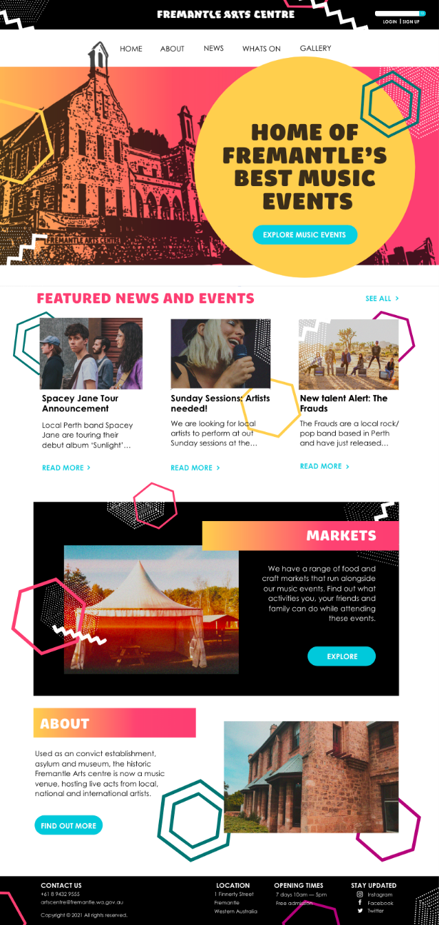
After this, development of the design compositions started to occur which combined both the wireframes and visual investigations and took into account all the initial research into the audience and competitors. The composition of the homepage followed the pattern of having a modern looking section followed by a more traditional looking section to reflect both the contemporary and traditional aspects of the music and venue. The colours explored in the visual investigation were used as a way to highlight call to action buttons and important aspects of information, as the cool blue created contrast with the other warmer colours. The events page and news page followed similar layouts, utilising the same colours and hexagonal shapes to create consistency across the website. During this time, a logo was also created which helped to solidify the brand. This logo can be seen on the top right corner of each of the compositions.
HOMEPAGE
NEWS PAGE
EVENTS PAGE
TESTING
The testing stage is not necessary for all projects but includes testing the functionality and usability of outputs, especially in website and app design, and changing aspects of the design based on the test results.
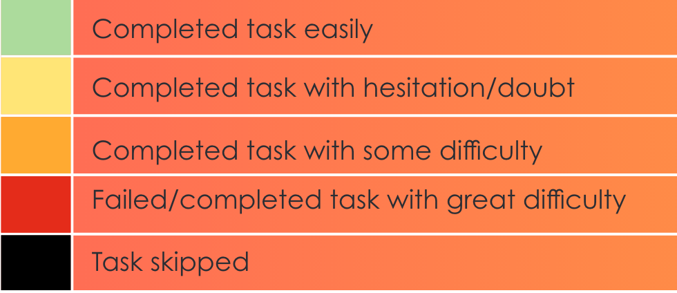
1. USABILITY TEST
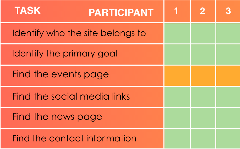
After coding the website into HTML, and then PHP, I conducted a usability test on the website to test the functionality of buttons, the navigation, and the design. The type of usability test conducted was an in person usability test in which the participant was encouraged to think out loud. Three participants were tested, their ages ranging from 20-25 all residing within the Perth metropolitan area. The key findings from this usability test were that the design was described as fun, contemporary and eye-catching, the navigational links all worked and lead to the right webpages and that the layout of content was easy to understand.
THE RESULTS
100%
of participants completed all tasks.

100%
of participants had trouble finding the events page

66%
of participants thought the events page could be improved.

100%
of participants could correctly identify the primary goal.
ANALYSIS (TASK BASED QUESTIONS)
AESTHETIC BASED QUESTIONS
1. What is the look and feel of this site?
2. What do you think of the layout of the events page?
THE GOOD
Relating to the questions about aesthetics, participants liked the colours and shapes used throughout the website as they created a contemporary, fun, and unique feel. Participants were easily able to identify the owner of the site, as well as the primary goal of the website, which was to promote the music events. Apart from finding the button for the events page, participants thought navigation was easy to understand and were able to find important links and information via this navigation.
THE BAD
All three participants made the same mistake when trying to access the events page, and were instead taken to the news page. They clicked on the ‘see all button’ on the home-page which is under the title ‘featured news and events.’ Two participants thought that changes could be made to the layout in the events page. Making both the filters section and the main image smaller, were some suggestions, as they were taking up lots of space, where as the events should be the focus of this page.
RECOMMENDATIONS AND ACTIONS
Relating to the questions about aesthetics, participants liked the colours and shapes used throughout the website as they created a contemporary, fun, and unique feel. Participants were easily able to identify the owner of the site, as well as the primary goal of the website, which was to promote the music events. Apart from finding the button for the events page, participants thought navigation was easy to understand and were able to find important links and information via this navigation.
DELIVERABLES
The deliverables includes the delivery of the final outcomes, outputs, products or identities. These outputs should address the issues raised within the problem statement.
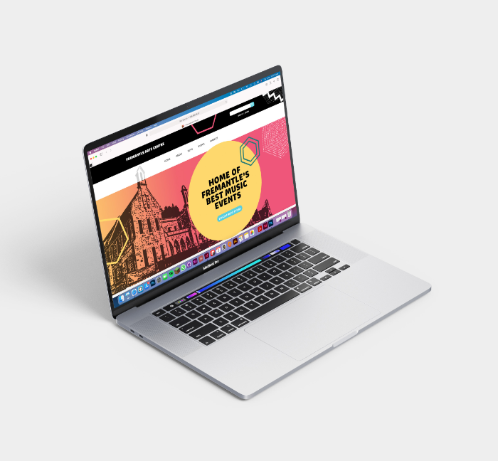
1. THE FINAL WEBSITE
The final website I have created ensures content can be found easily through the use of appropriate headings and placing the main navigational links at the top of the page. Changing the drop down menu, and the filters section in the events page increased the usability of the website and solved the problems the users were having. The users needs were successfully met and the initial problem of the website being not engaging and boring was addressed.