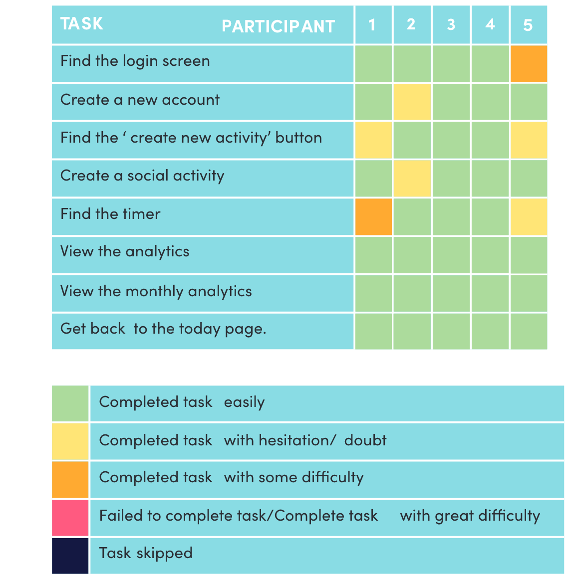
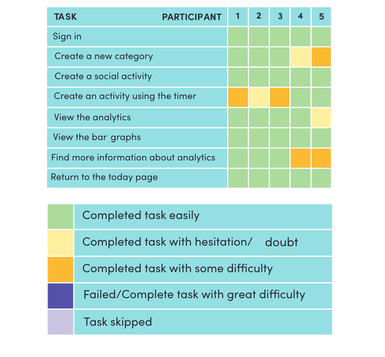
LIFE FIT: ADDRESSING AN UNEVEN WORK LIFE BALANCE

Branding | App design

THE PROBLEM

There is no doubt that being a University Student is difficult, having to make time for study, work, socialising, exercise and more. Sometimes, time management can be hard and finding the right work-life balance between the different aspects of your life even more so. I created the concept and visual identity for app ‘Life Fit’ for the purpose of helping university students to keep a healthy balance between the different aspects of their lives. Tracking the inputs of categories such as work, study and socialising, Life Fit provides its users with a visual indicator of where they spend their time was spent so they can manage and dedicate time more effectively.

RESEARCH

The research stage includes defining the target audience and gaining a deeper understanding into the people affected by creating personas, empathy maps and conducting interviews. Competitors are also looked at to see what has been done in the past and whether or not these ideas have worked.

1. THE TARGET AUDIENCE

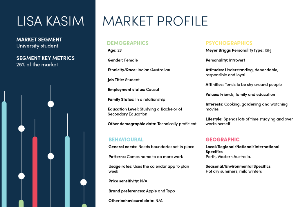
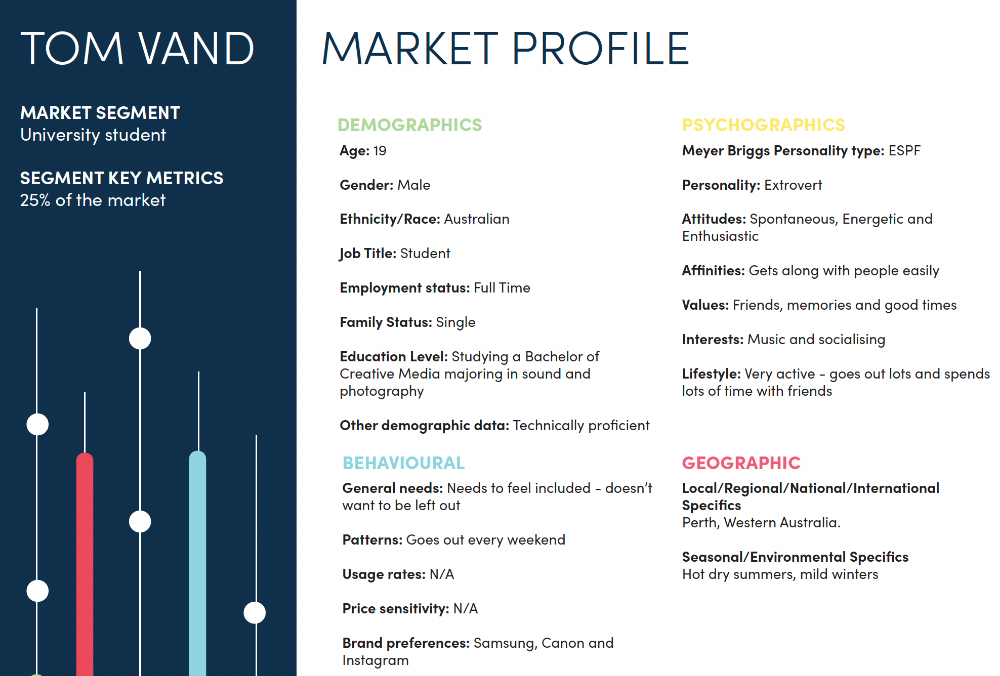
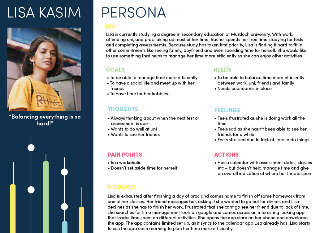
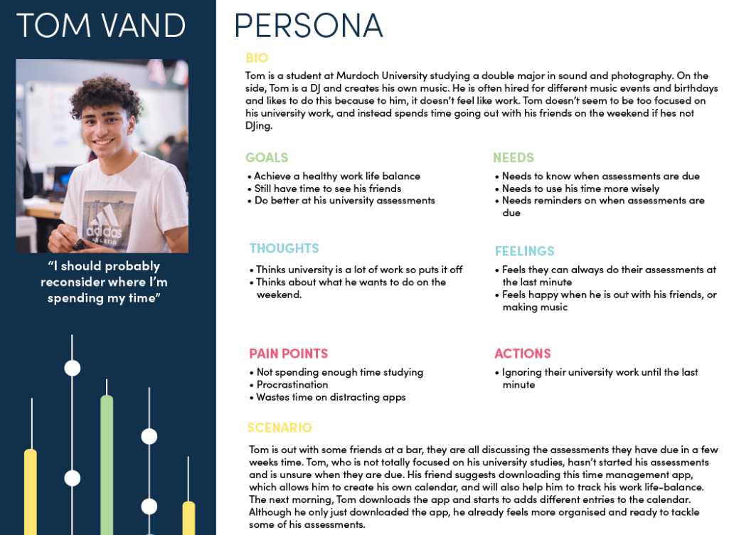
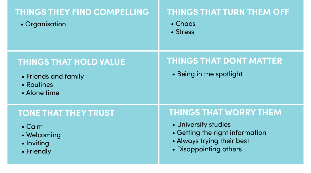
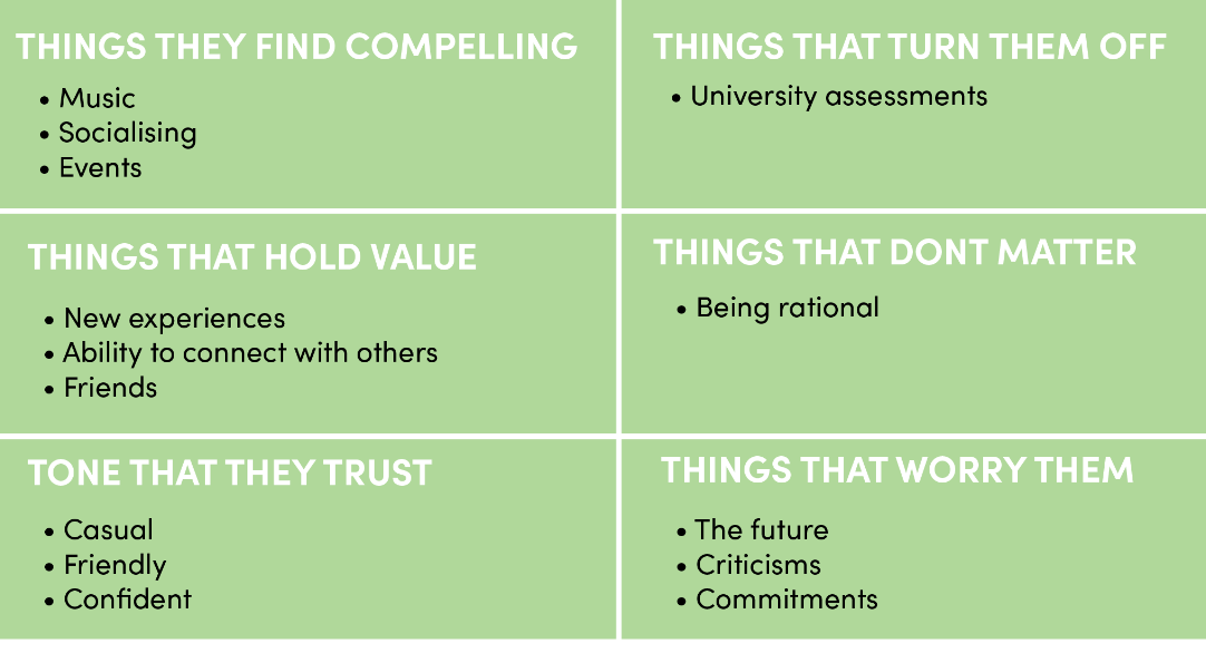
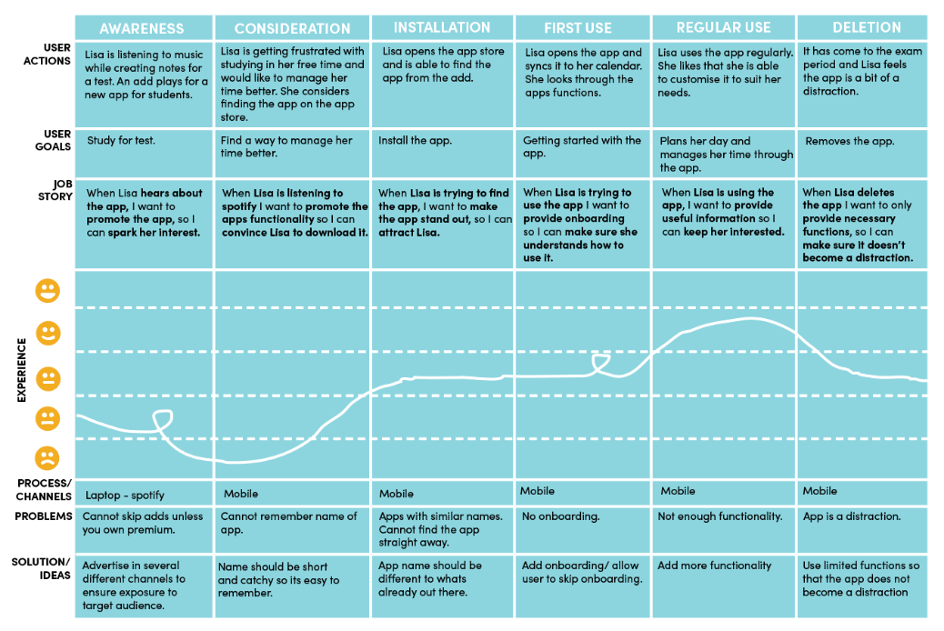
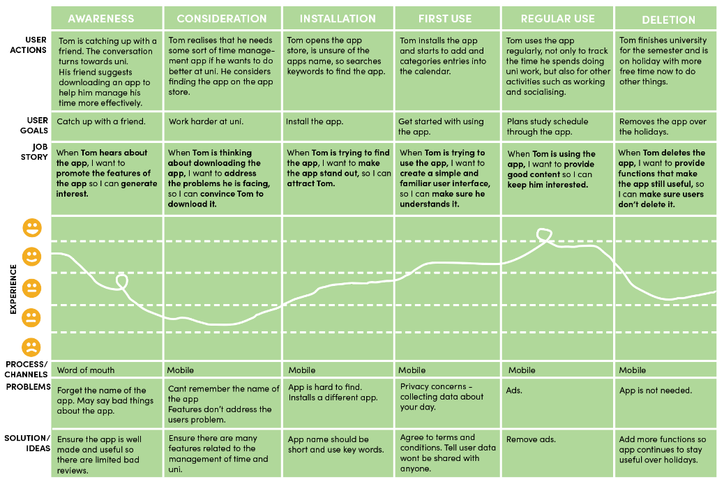
Based on this information I had found I looked at the target audience creating market profiles, personas, a user matrix and journey map. The market profile, persona and user matrix allowed me to gain a deeper insight into the users demographics, behaviours, likes, dislikes, thoughts and feelings. The user journey map was used to create a scenario of the user coming across and using the app. This helped me to identify possibilities of where the user could hear about the app, why they are using the app, and problems that may occur.

MARKET PROFILE

PERSONA

USER MATRIX

LISA KASIM

TOM VAND

JOURNEY MAP

LISA KASIM

TOM VAND

2. COMPETITOR ANALYSIS

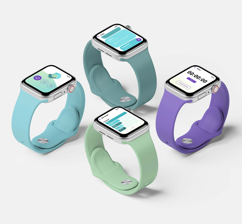
I looked at two similar apps found on the app store to gain an idea into how they were tracking time management. I also looked at the design to see what elements worked and what needed improvement and took these findings on when designing my own app.

COMPETITOR ANALYSIS 1 - ATIMELOGGER PERSONAL TRACKER

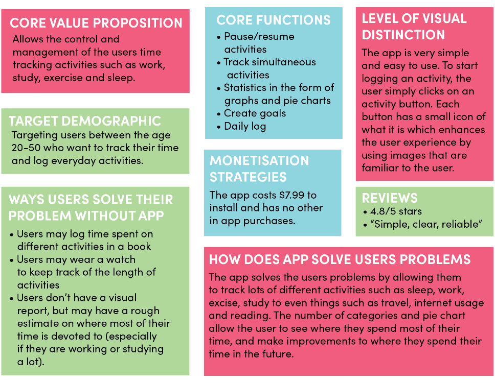
I think the app does a brilliant job at meeting the users needs as it really is able to track all activities and help with time management. Relating to the 7th Heuristic principle, the user is able to customise and personalise the app by adding a new category if an activity doesn’t fit into the pre-made categories. The pie chart gives a visual of where the user spent their time during the day or week and is aesthetically pleasing to look at. Relating to the 8th Heuristic principle, I like the minimalistic design of the app as it prioritises the content and the features of the app. I dislike how many activities the app has that a person can track. This is because the app could become a distraction or even an obsession as they start to track every little activity.

Some design decisions I would like to make with my app based on this competitor analysis, is to keep the number of categories or activities limited so it does not become a distraction. But also allow the user to have the option to create customisable categories so they feel they have control and freedom do to what they want in the app. Also having goals the user could set and the app could suggest personalised goals based on the users data.

COMPETITOR ANALYSIS 2 - TIME PRO: TIME MANAGEMENT

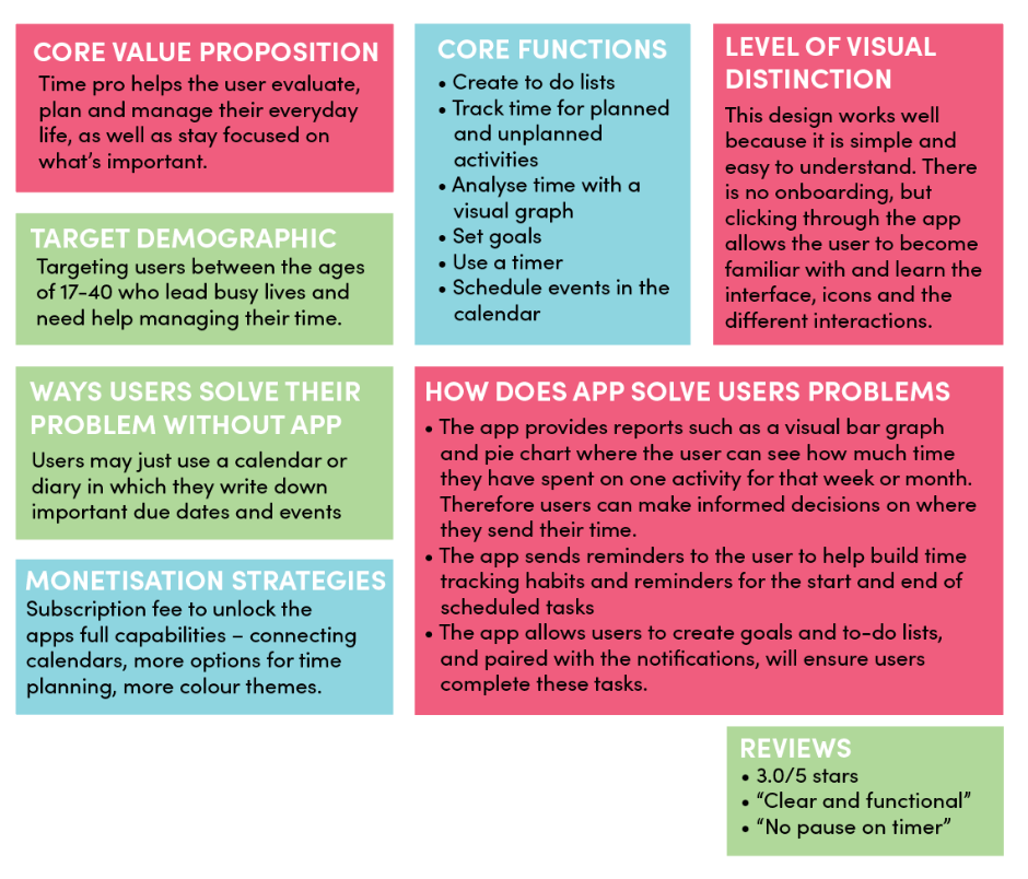
I think that this app does a great job of meeting the users needs. The graph and pie chart are very clear and the user is instantly able to see how much time is spent where. Relating to the 3rd Heuristic principle of user control and freedom, exits are clearly labeled and placed at the top of the page so users can exit a page quickly. Relating to the 8th Heuristic principle, I like that the app is quite simple and aesthetic. It doesn’t focus on the colour schemes or the visual customisation of the app itself as this can become a distraction for some users. Relating to the 4th heuristic principle, because the visual design of the app is consistent throughout it aids in the memorability and learnability of the app. I dislike that the app has a subscription users can buy, as I believe these features should come with the free version.

Some design decisions I would like to make based on this competitor analysis is to have a minimalistic design with visual emphasis placed on the graphs, and buttons to help with learnability and memorability. Also having a timer that has a pause function in case users want a break and return to the activity later.

3. KANO MODEL

I started to think about the features that this app could include. I used the Kano model to find out about the customer satisfaction rating for the features of my app. I asked users six different questions relating to the features of the app with the results shown below.

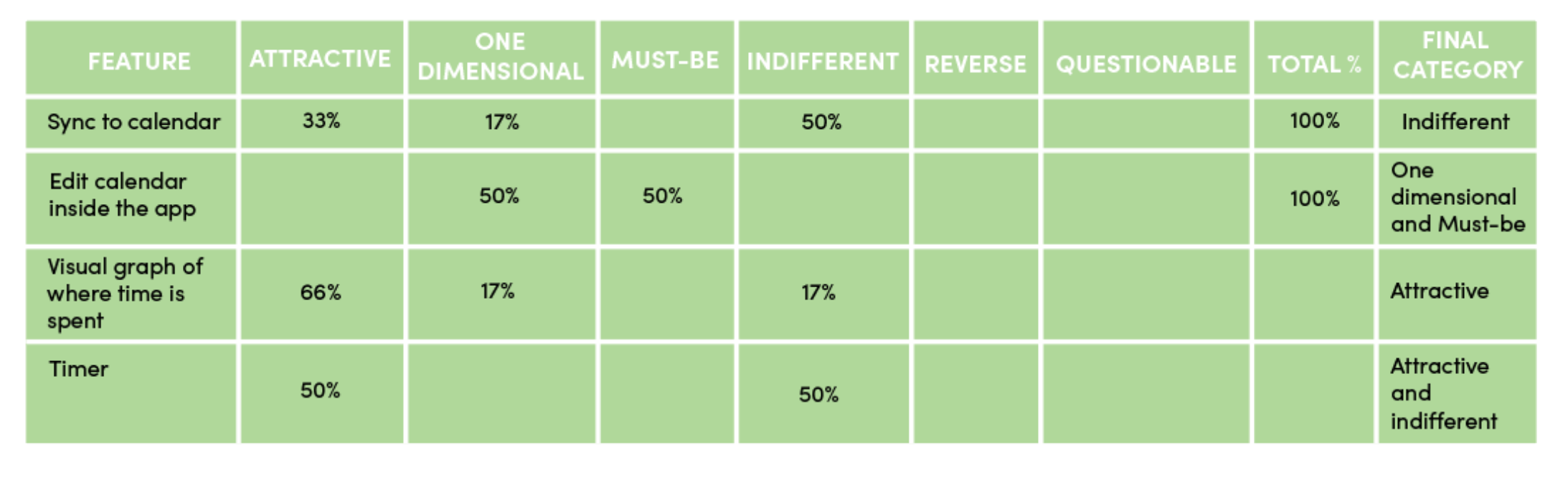
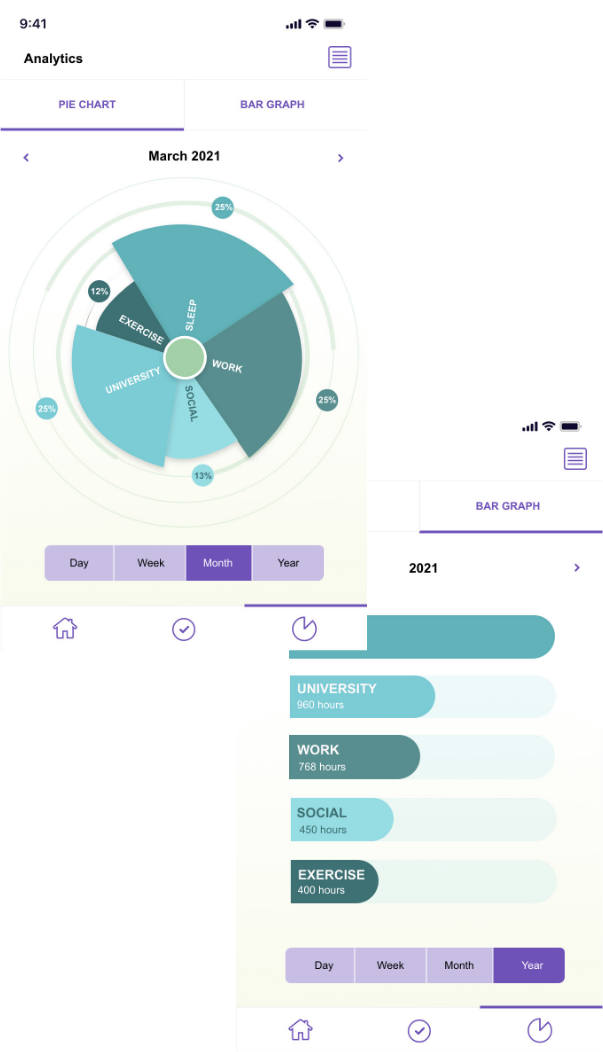
From this chart, it seems the most attractive feature is the visual charts with 66%. This feature is important as it allows the user to see to see where they are spending their time and what actions they need to take in order to improve or maintain their work life balance. The feature of being able to edit the calendar was evenly split between two different categories – Must be and One-dimensional. As the app is a calendar, it is expected that users will be able to edit it, and will increase satisfaction if fulfilled. Being able to sync the app to an already existing calendar app on a user’s phone was determined to be indifferent with 50%. This result shows that the aspect does not directly result in customer satisfaction or dissatisfaction, but may save the user time from creating a calendar from scratch if they already have one. The timer was also a feature that was evenly split between two different categories – Attractive and indifferent. This feature may appear attractive to some users as they can track activities accurately and while they are completing them. It may be indifferent to other users due to the fact there are other ways to add a time-slot or activity such as editing the calendar.

DEVELOPMENT 1

The Development stage includes creating rough sketches and refining them with computer software, as well as experimenting with different elements such as colour, grids, layouts, typography and images until an identity is created.

1. SYSTEM MAP

To start the development of the app, I looked at navigation. I created a system map to show the the different screens the app may have.

After the user logs in, this app has a flat or lateral navigation, allowing the user to move between the apps top-level screens. Each of these top level screens contain their own hierarchical links, allowing the user to make once choice per screen. These hierarchical links also allow the user to return to the apps top level screens easily.

2. TASK FLOW DIAGRAMS

I created a task flow diagram to show how the user may flow through the app and to uncover the purpose of the app, as well as the motivations, objectives and goals of the target audience. I created an error path and two goal paths.

ERROR PATH

The error path occurs if the user inputs the wrong login details. This error is resolved by sending an email to the users email and then taking the user back to the homepage, where they can try to login again.

GOAL PATHS

The first critical goal path is for the user to view the analytics page. This path is very simple, as the analytics page is one of the top level screens. The user can then flick through the different views of the analytics page including weekly, monthly and yearly. The user can then return to the main page

The second critical goal path is for the user to create a new activity. The user has two ways to do this - the timer and the ‘create new activity button’. The timer allows the user to accurately track activities where as the ‘create activity button’ allows a quick and easy input. After selecting either option, the user must then choose the category it belongs to and give the activity a title. The user can then return to the main page.

3. WIREFRAMES

I began developing wireframes. Like the task flow diagrams, the wireframes helped to demonstrate how the user will move through the app, but with lo-fidelity mockups of what the screens may look like.

ONBOARDING

The onboarding for this app utilises a benefits based onboarding approach in which one benefit is displayed per screen. There are three onboarding screens and the user moves through these screens by swiping left. The onboarding is then followed through with sign up.

ONBOARDING

The onboarding for this app utilises a benefits based onboarding approach in which one benefit is displayed per screen. There are three onboarding screens and the user moves through these screens by swiping left. The onboarding is then followed through with sign up.

ERROR PATH

GOAL PATHS

TESTING 1

The testing stage is not necessary for all projects but includes testing the functionality and usability of outputs, especially in website and app design, and changing aspects of the design based on the test results.

1. USABILITY TEST

I conducted a usability test on my work-life balance app to test the navigation of the app and to find out whether the user flows through the app easily. The type of usability test conducted was an in person usability test in which the participant was encouraged to think out loud. Five participants were tested, their ages ranging from 19-25 and all were current university students, the target audience at which this app is aimed. Key findings from this usability test included that the navigation of the app was mostly quite clear and easy to follow, with a few minor changes to be made, and that the layout of content was easy to understand and learn.

THE RESULTS

100%

of participants were able to successfully complete all tasks.

80%

of participants were able to create a new account without hesitation.

60%

of participants hesitated in finding how to create a new activity.

100%

of participants thought Life Fit would be help to create a balanced lifestyle.

TASK ANALYSIS

THE GOOD

Users mostly found that the navigation of the app was quite clear and easy to understand, with only some hesitation. Users also liked the aesthetics of the app, particularly the analytics page as they liked the contrast and thought the pie chart had an interesting design and was eye catching. Users liked the drop down calendar in the ‘create activity’ screen, as it made it easy to choose a date and time.

THE BAD

Several users had trouble finding the timer and the ‘create activity icon’ due to them being not obvious, small and close together. One user thought that using more than one type of graph may be beneficial, as the pie chart is limiting. Another user thought that the category buttons on the categories page were check boxes and was confused when taken to another page once they clicked the button. Having a homepage, instead of the app opening to the today page when fist opened was another user suggestion. One user was confused when the app started with the onboarding instead of the login screen. They werent sure what to do.

RECOMMENDATIONS AND ACTIONS

To move the timer and ‘create new activity’ buttons further apart or down the bottom of the page so they can be easily and quickly identified by the user. As well as a pie chart that shows percentages, create a bar chart that shows how many hours were spent on each category. To change the buttons on the category page to a drop down menu. To create a homepage or dashboard page that links to the two main goals of the app - creating activities and viewing the analytics.

DEVELOPMENT 2

1. LOGO

I started to develop a logo for the app by looking at shape. I wanted to keep with a circular theme, as I felt that this resembled a clock, symbolising time. This was fitting due to the fact that the app tracks time. I experimented with lots of circular shapes until I came to one that I felt would be suitable.

I then experimented with using colour by applying different colours to the logo and seeing which ones looked best. I decided on blue-green colours as they provided a nice gradient and I also thought they could be used to symbolise the different categories that the app tracked.

2. GRAPHICS

After the logo, I started the create the other graphics needed for the onboarding and monetisation screens as well as the icons for the navigation. These graphics contained similar colours used in the logo, with the addition of purple being used in the buttons to contrast and draw the users attention.

3. COMPOSITIONS

The development of the design compositions started to occur which combined the wireframes, chosen colours and graphics I had made.

TESTING 2

1. USABILITY TEST

The app, now in a high-fidelity format, was tested again aimed. Key findings from this usability test included that the sign in and process of changing a forgotten password was quite easy, with the navigation of the app being mostly clear and easy to follow, with a few minor changes to be made. Five participants were tested, their ages ranging from 19-25 and all were current university students, the target audience at which this app is aimed. Key findings from this usability test included that the sign in and process of changing a forgotten password was quite easy, with the navigation of the app being mostly clear and easy to follow, with a few minor changes to be made.

THE RESULTS

100%

of participants were able to successfully complete all tasks.

60%

of participants had trouble finding the timer function

40%

of participants faced difficulty finding more info about their analytics

100%

Of users were able to successfully change their forgotten password

TASK ANALYSIS

THE GOOD

Users mostly found that the navigation of the app was quite clear and easy to understand, with only some hesitation. All users found it easy to sign in and create a new password when the old one has been forgotten. All users were easily able to create a new activity, view the pie and bar graphs and navigate back to the homepage. Most users thought that the overall colour scheme of the app looked good, with colours described as calming and relaxing.

THE BAD

Several users had trouble finding the timer button. This could be due to its position at the top of the page. Relating to aesthetics, one user thought that more purple colours could be incorporated into the graphics of the app as it didn’t feel very harmonious. Two users had trouble finding more information about their analytics and kept trying to tap on the bar graphs and individual sections of the pie chart.

RECOMMENDATIONS AND ACTIONS

To make the different sections of the graphs clickable so users can access more detailed information about their analytics from the graph, instead of the button at the top right. To put more purple in the graphs and also the onboarding images at the beginning, and more blue and green into the buttons to make the app more unified. To move the timer in the same section as the ‘create new category’ and ‘create new activity’ button as it provides the same sort of function.

DELIVERABLES

The deliverables includes the delivery of the final outcomes, outputs, products or identities. These outputs should address the issues raised within the problem statement.

1. THE APP

Life Fit was developed for the purpose of helping university students to keep a healthy balance between the different aspects of their lives. Tracking the inputs of categories such as work, study and socialising, Life Fit will provide you with a visual indicator of where your time was spent so you can manage and dedicate your time more effectively.

With lots of students reporting feeling stressed, and burnt out from spending too much time either working or studying, this app encourage students to take time out for themselves, exercise and socialise to achieve a healthier work-life balance.

View the prototype

THE BENEFITS

1. Create a healthy work life balance

2. Improve time management skills

3. Improve overall wellbeing

THE FEATURES

THE CALENDAR

Use a calendar to manage your activities and events. Displaying categorised activities in different colours, this calendar will allow you to view what you have on for the day from just a glance.

THE TIMER

Want to time how long you run for? No sweat. The timer function can track activities accurately while while you are completing them.

THE ANALYTICS

Receive a visual indicator in the form of two different graphs - a pie chart and bar graph. View these daily to see where your time was spent and take action to improve or maintain your work life balance.

Next Project
BACK TO TOP