EXPOSING PERTHS HIDDEN STREET ART AND ARTISTS
Branding | Publication design
RESEARCH
The research stage includes defining the target audience and gaining a deeper understanding into the people affected by creating personas, empathy maps and conducting interviews. Competitors are also looked at to see what has been done in the past and whether or not these ideas have worked.
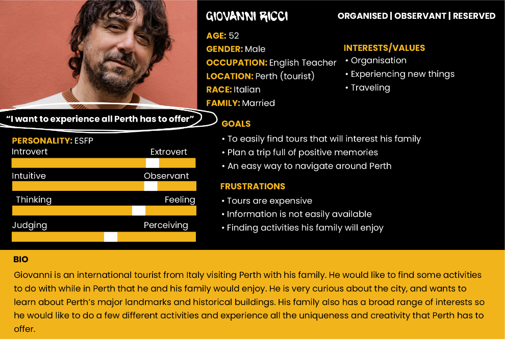
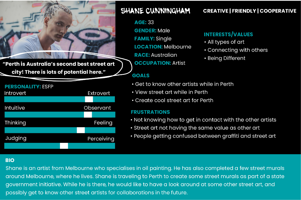
1. AUDIENCE AND STAKEHOLDERS
For this publication, the audience consisted of tourists and locals. This book benefits both of these audiences, as this self-guided tour will be another activity that not only tourists, but locals can do while in Perth and will enable them to experience the uniqueness and creativity Perth has to offer.
Stakeholders included small businesses such as cafes, shops and communities. They will benefit as it will bring tourists and locals to the area, generating more business and traffic. The artists themselves are also a key stakeholder as it will help to give them recognition and exposure for their work which may help give them more career opportunities
2. COMPETITOR ANALYSIS
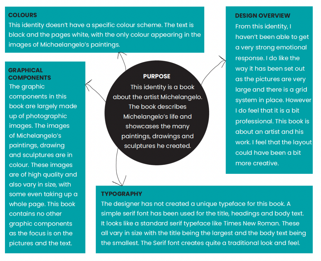
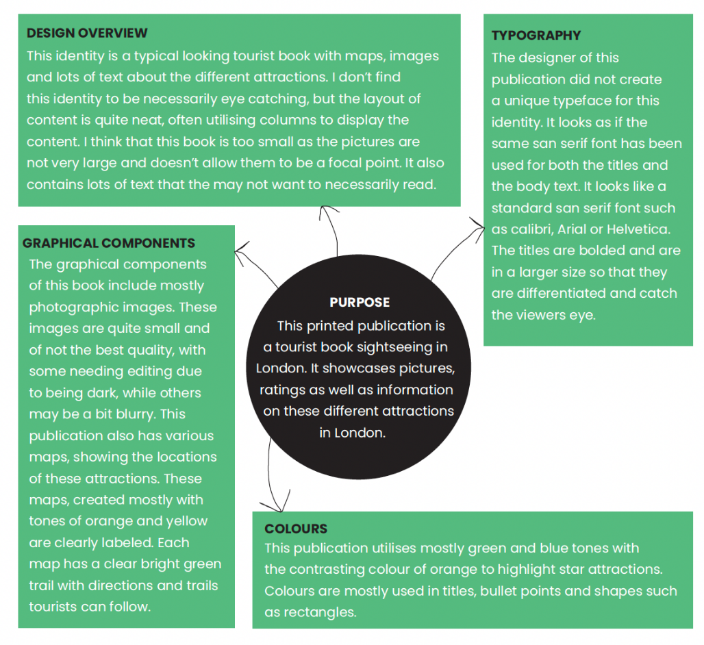
I undertook a competitor analysis of three similar publications to identify positive aspects that could be used in my own publication, and other negative aspects to avoid. From these, I found that creating a strong brand that accurately reflected the content inside was important, as well as having a great emphasis on the photographs to emphasise the artists work to draw the viewers eye.
COMPETITOR ANALYSIS 1 - MICHAELANGELO
COMPETITOR ANALYSIS 2 - MUST SEES LONDON
COMPETITOR ANALYSIS 3 - PUBLICATION: FORM BUILDING A STATE OF CREATIVITY
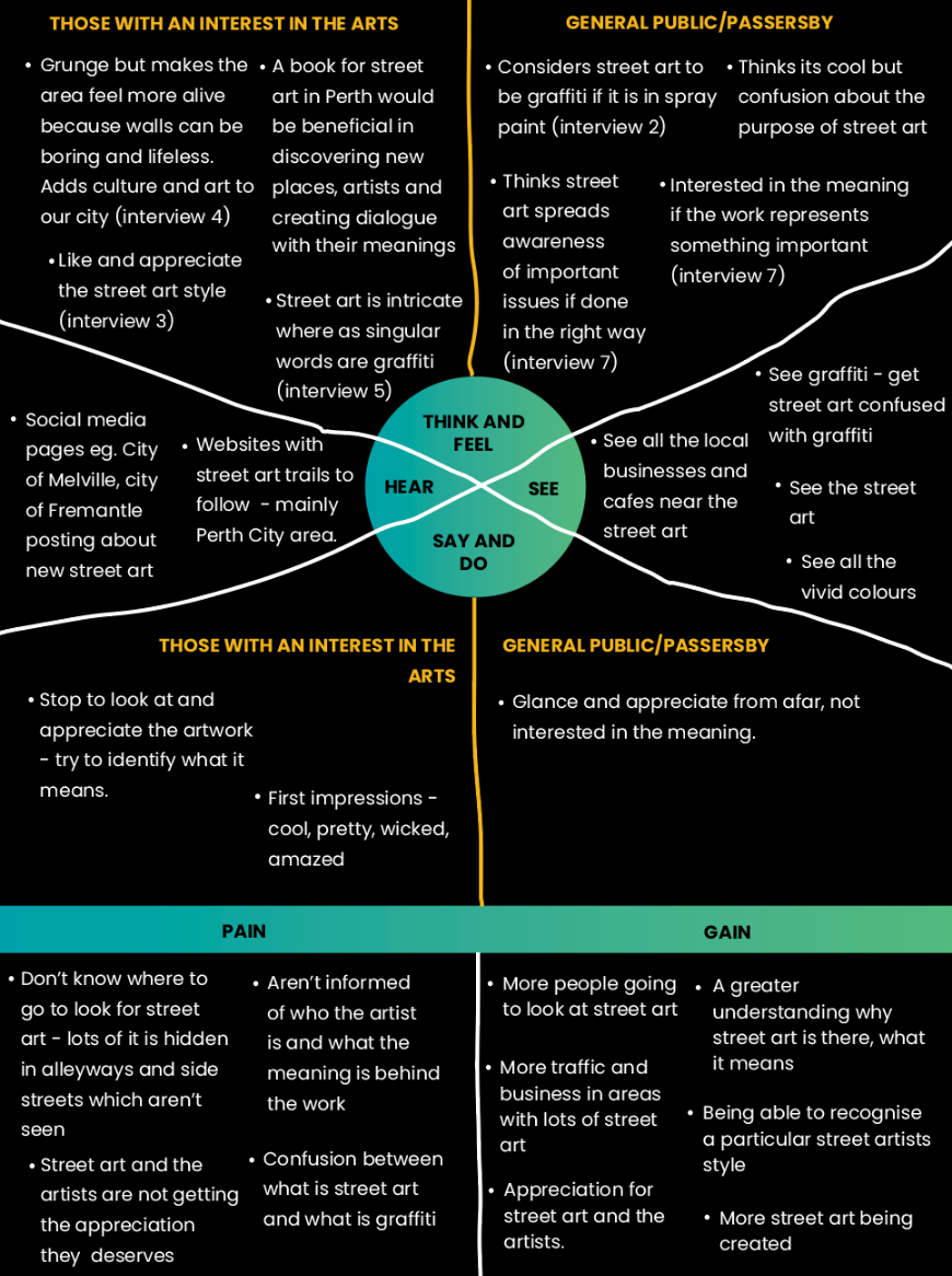
During the design stage, I interviewed many people on Perth street art, and whether its something they paid attention to and appreciated, or if it something they ignored. Some of the questions I asked included:
It was obvious from these interviews that people were only somewhat slightly aware of the street art around Perth.
VISUAL INVESTIGATION
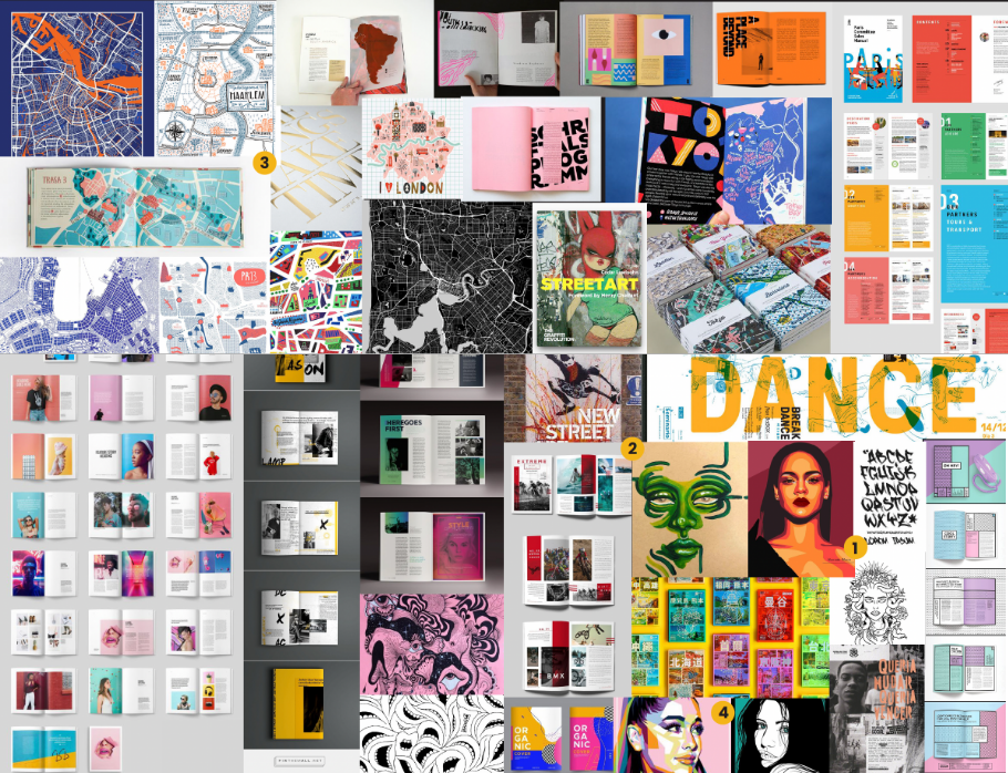
The visual investigation stage includes creating mind maps to help generate ideas for the development stage. During this stage, I also look at images, websites and other content found on the internet, as well as objects, books and other materials found in my surroundings to find inspiration.
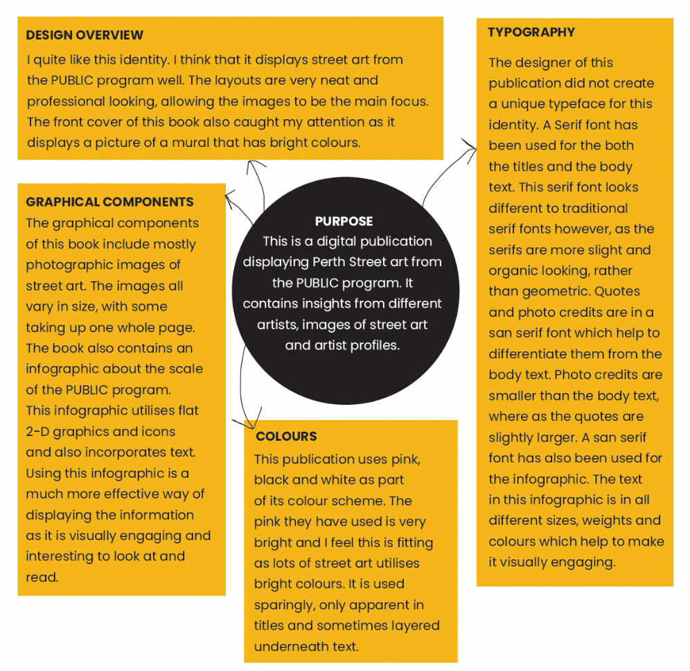
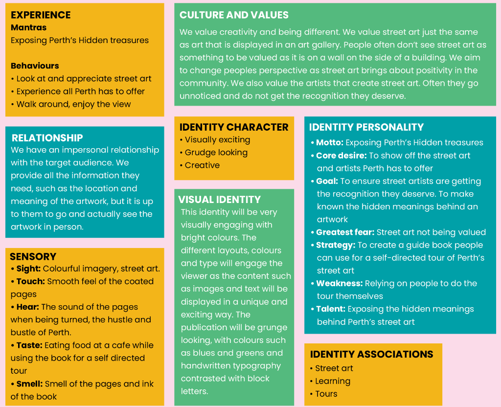
After all this initial research, I started to have an idea of what this identity would look like and what outcomes it would create. A brand and identity summary was created to identify and solidify the identity personality, character, core values and relationship with the target audience.
DEVELOPMENT
The Development stage includes creating rough sketches and refining them with computer software, as well as experimenting with different elements such as colour, grids, layouts, typography and images until an identity is created.
Based on the visual investigation I had created, I started to experiment with different design aspects of the book, first looking at typography. I wanted to include a few different typefaces as I wanted to include different fonts for the headings and body to create variation within the book. For the headings and subheadings, I wanted a font that was bold and thick and chose to use the font Poppins. This font has many of variations, such as bold, semi bold, regular etc. I liked the straight edges and simple modern look that it provided as it was easy to read.
Since the book was about street art, I chose a decorative font that reflected this. I felt that the font ‘Walnut’ reflected this urban and grungy feel I want to portray and would contrast well with the neater and simpler fonts used for the body text and the headings. I planned to use this font behind the heading text like the example to the right.
While looking at typography, I also experimented with colour. The final colour scheme chosen consisted of greens and blues with the contrasting colour of yellow. These colours created a grungy and funky looking colour scheme that would allow the main content such as the images to stand out. These colours also symbolised uniqueness, creative expression and learning, which is exactly what I wanted the guidebook to portray.
3. GRIDS
The initial grids I created for the publication were quite simple and had been inspired from the books from the competitor analysis, as well as some of the layouts I found in the visual investigation. These initial grids consisted of a 2x4, 2x3, 3x3, and 3x4 grid. However, it was found during the development of the final book that these grids weren’t suitable as they did not allow maximum flexibility in the composition.
A 7x4 and a 7x3 gird were also created to work in conjunction with the other grids. Although slightly more complex, these new grids allowed me to use the pages to their full potential, displaying lots of content in a neat and oriented way. These grids also allowed for the pages to have a similar look and feel unifying the book as a whole and creating cohesion.
CONTENT COLLECTION
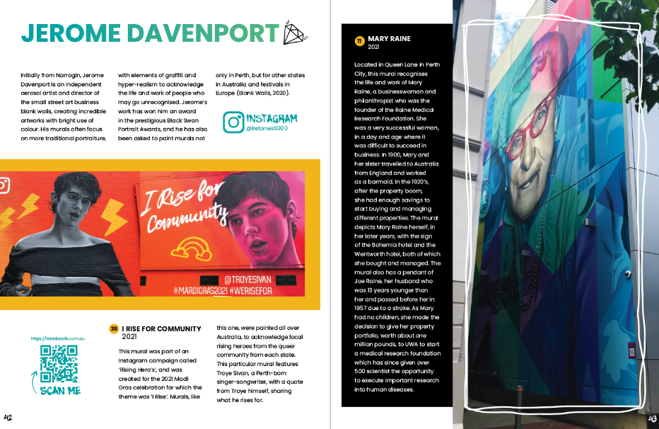
After sorting out the main aspects of the brand, I started to collect the content such as the images, artist profiles and mural descriptions, as well as creating the graphics. The were many challenges with this part of the project such as collecting the images as I had limited time to do this due to other commitments. Collecting the content for the artist profiles and the mural descriptions was difficult due to the limited information about them online, so the murals I could not find meanings for I did not end up using. Creating the graphics was also difficult as they were very time consuming due to being digital paintings.
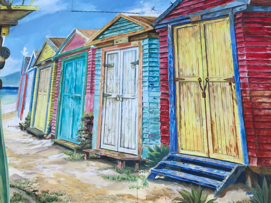
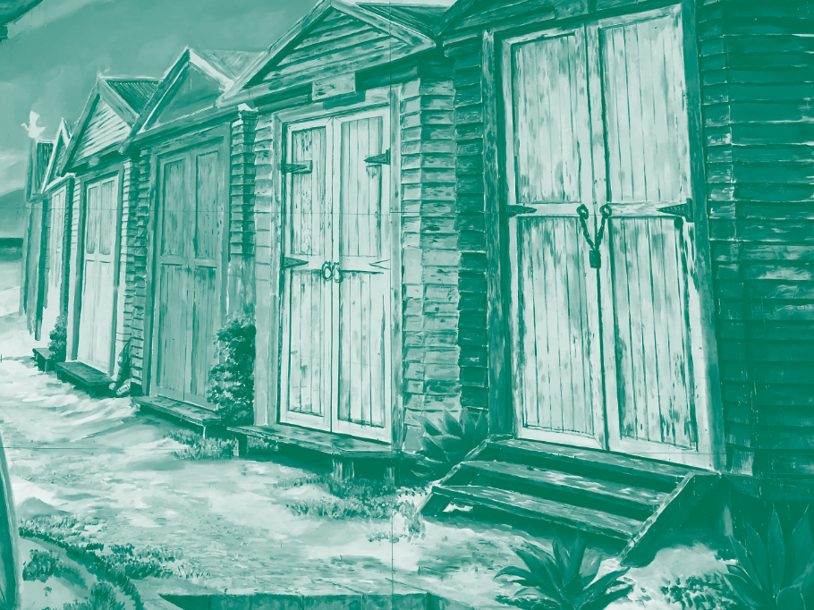
The images were collected on three different days. The images I took were of high quality, however some murals were hard to get a picture of due to them being covered by plants, or being placed high up on a wall. However I was able to crop most images quite well and remove the background scene so the focus was just on the mural. I did not overly edit these pictures as I wanted them to be a true representation of the mural that was there, and as some had deteriorated quite badly, this was hard to do. I edited the brightness and contrast as well as the vibrance and saturation of the images so that they stood out within the book and captured the viewers attention. While in Photoshop, these images were also changed to 300DPI and CMYK colour mode so that they would be fit for printing. Present on this page are some examples of how I edited the images.
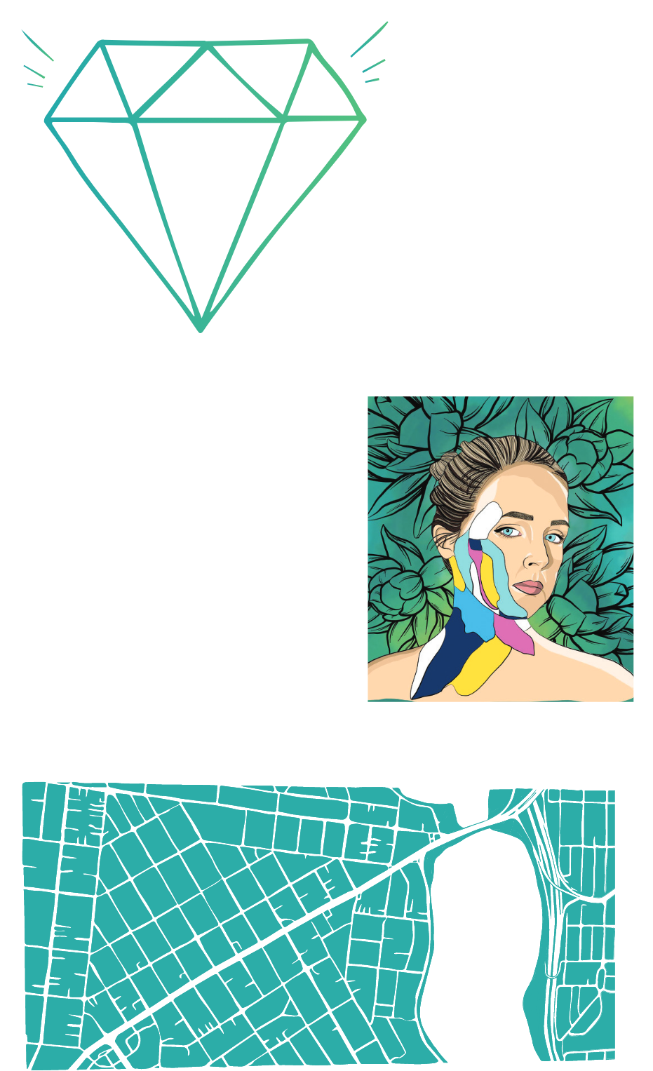
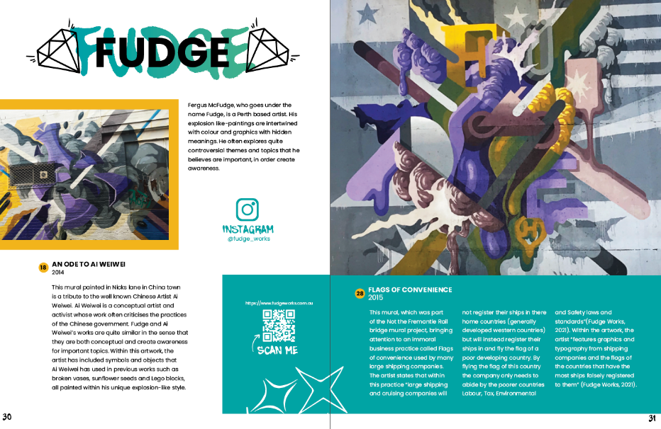
The graphics I created for this publication were all hand drawn using a tablet. The first graphics I created were lots of little stars. I felt that these graphics were fitting to reinforce the ‘treasures’ part of the title and to reinforce that street art should be valued like any other piece of art. While experimenting with the stars, I created a diamond and felt that this graphic was appropriate as the main image or logo for the book. For the final publication this image was present on the front cover and also present throughout the book next to some of the artists names. These graphics were also diverse as the different colours from the colour scheme could be applied to them.
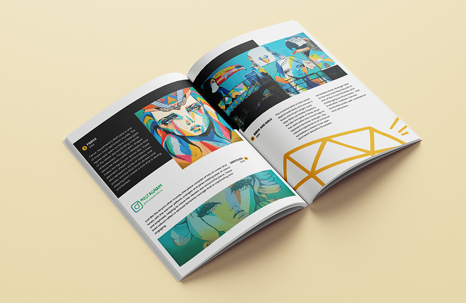
For the final publication, I also wanted to include some images of artists however this was not possible due to copyright issues. Instead, I came up with the idea of creating digital paintings of these artists and thought that this would match the street art style well. I first created a digital painting of artist Anya Brock who is known for her bright use of colours. I felt that adding the flowers in the background was fitting as Anya often includes flowers in her work, relating to the underlying theme she explores of feminine strength.
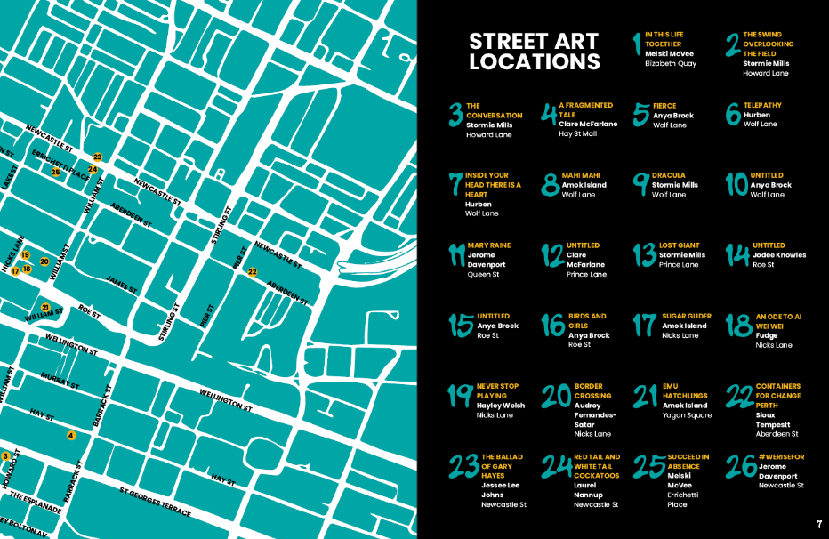
I also created maps of the locations of the murals. These were all hand drawn on a tablet which created an imperfect and fun feel, but also accurately representing the locations of the murals. Within the final publication, these maps were displayed at the very beginning, and also scattered throughout the book. They were also filled in with a block colour to suit the branding of the rest of the publication.
6. LAYOUTS
After deciding on the visual elements for the book, I could start working on the final deliverable which was the book. I created some initial page layouts in the form of wireframes to help give me ideas of where the content could be placed.
DELIVERABLES
The deliverables includes the delivery of the final outcomes, outputs, products or identities. These outputs should address the issues raised within the problem statement.
1. THE FINAL BOOK
By combining all the visual elements such as colour, typography, grids, graphics and images, I started to create the layouts for the publication. These layouts are eye catching, interesting and trendy which accurately represent the street art style.
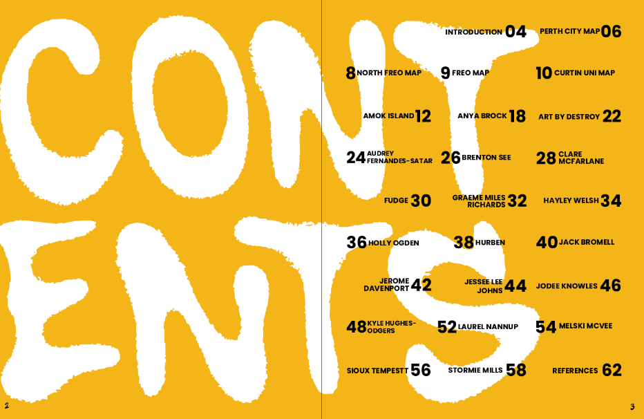
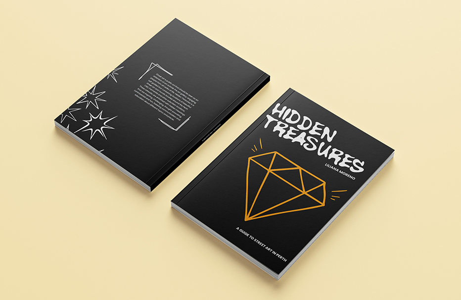
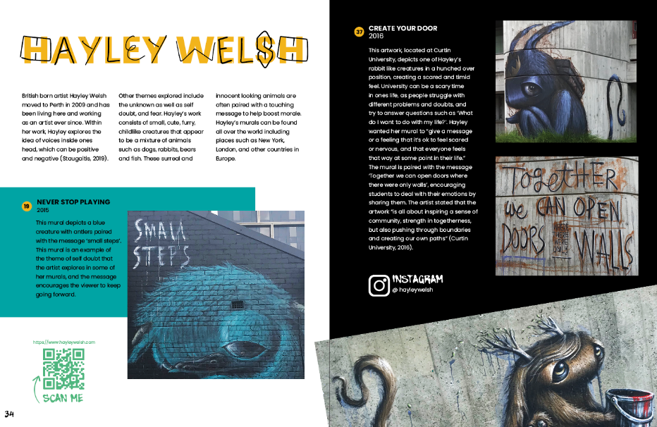
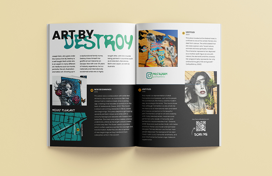
Displaying 52 artworks from 20 different artists, this perfect bound book is 64 pages long and full of images and descriptions of the street art around Perth. The book also contains artist profiles, as well as an introduction, explaining to people why street art is important to the community. Scattered throughout the pages are also social media profiles and QR codes to the artists websites to help generate exposure for them.