RESEARCH
The research stage includes defining the target audience and gaining a deeper understanding into the people affected by creating personas, empathy maps and conducting interviews. Competitors are also looked at to see what has been done in the past and whether or not these ideas have worked.
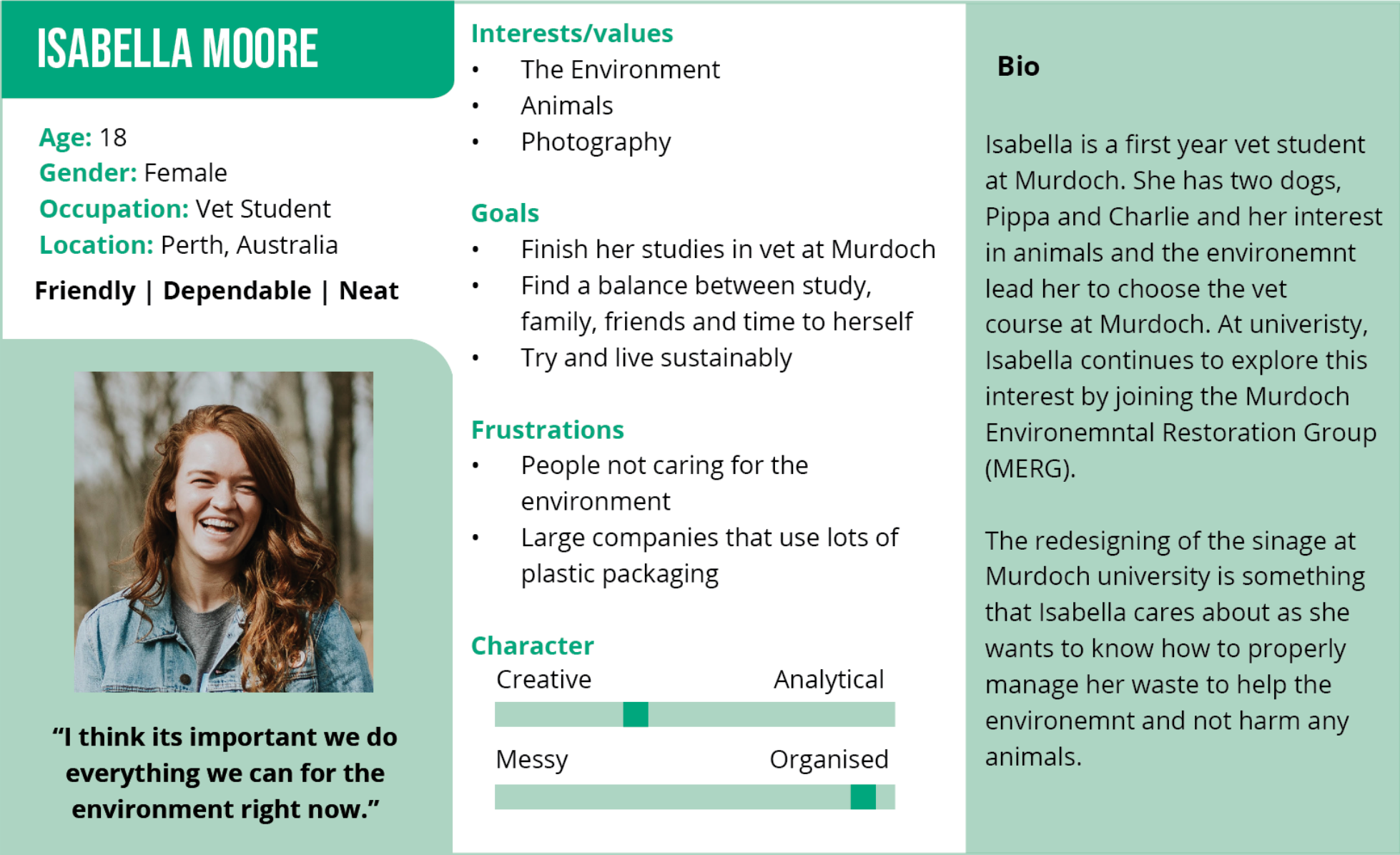
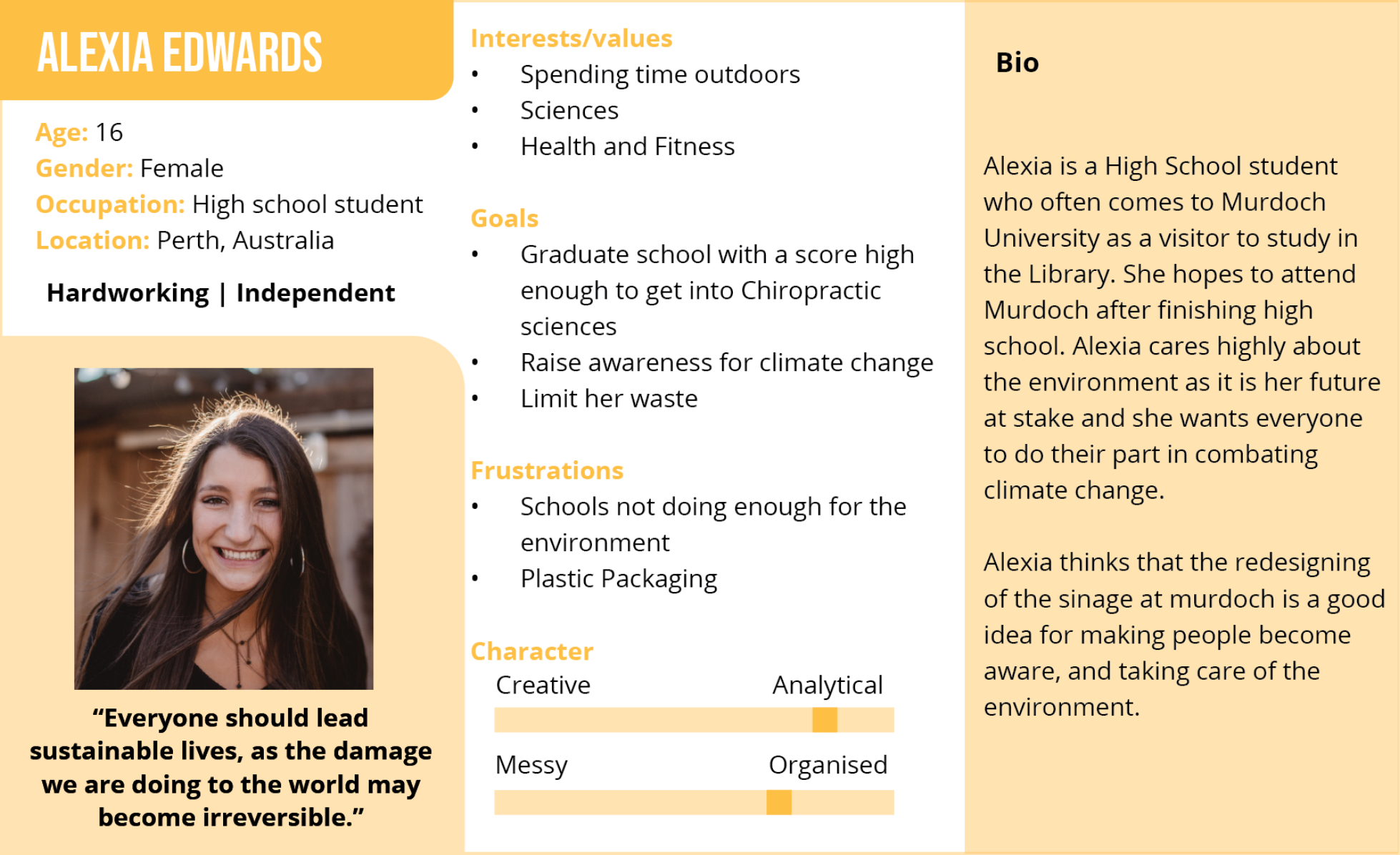
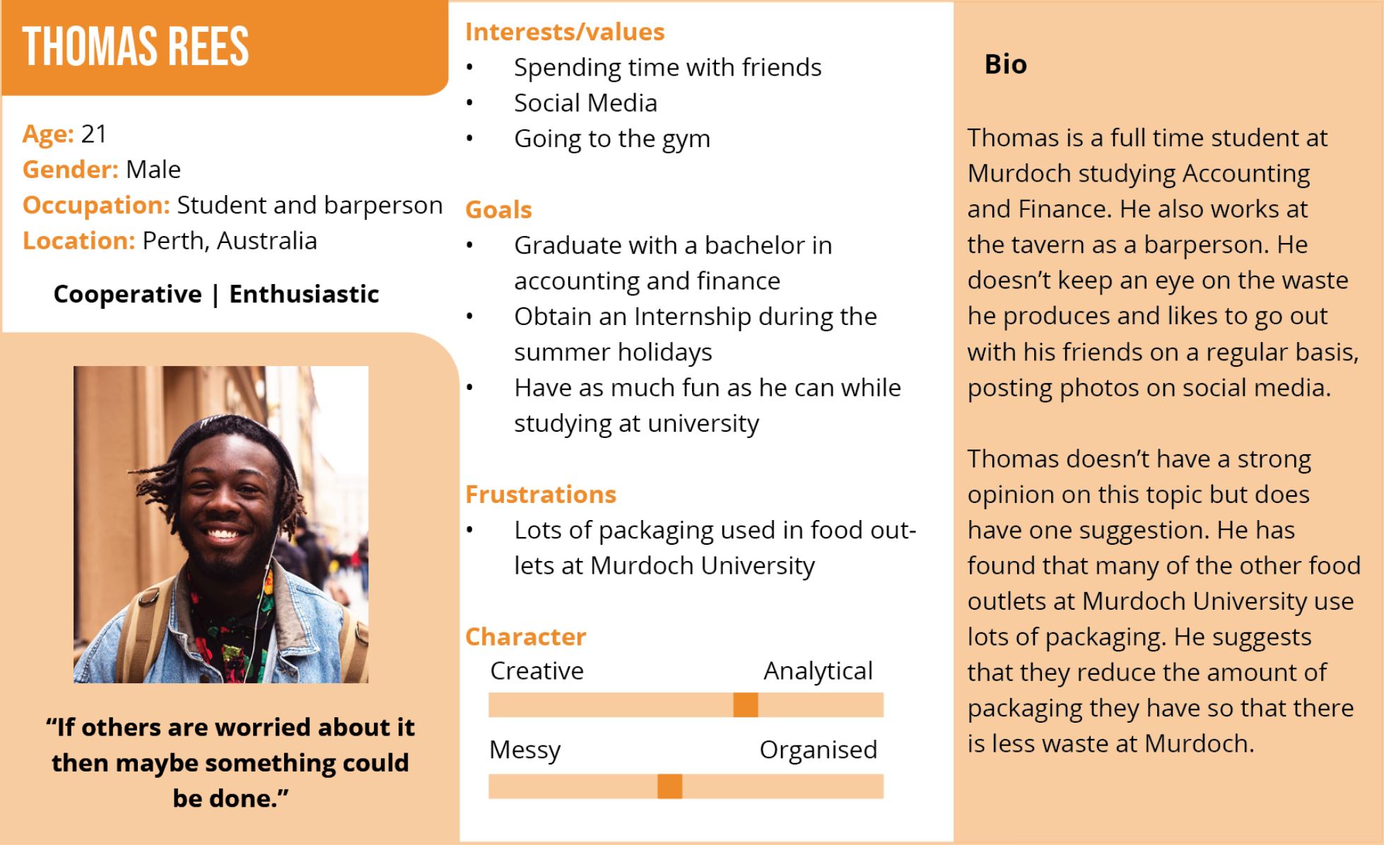
1. PERSONAS
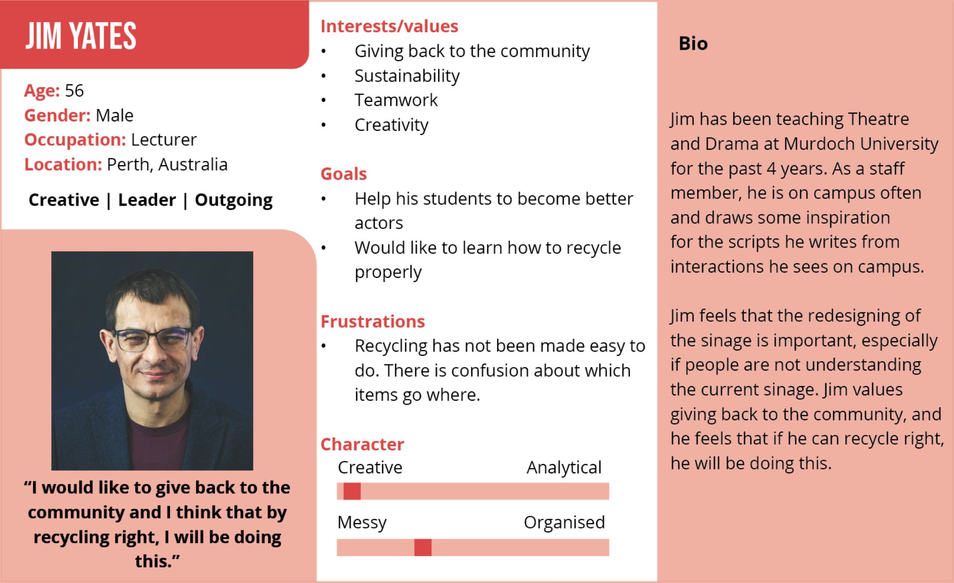
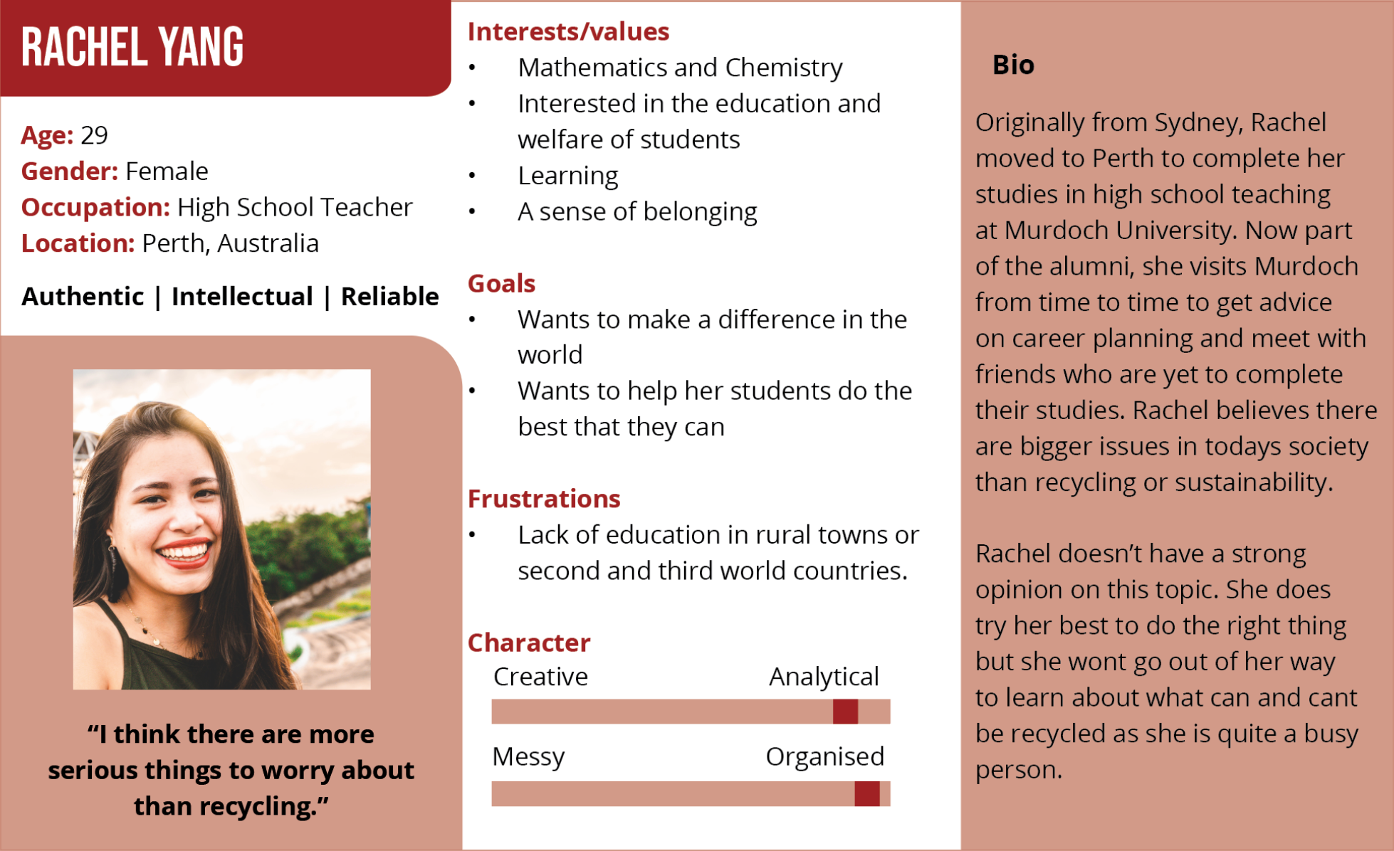
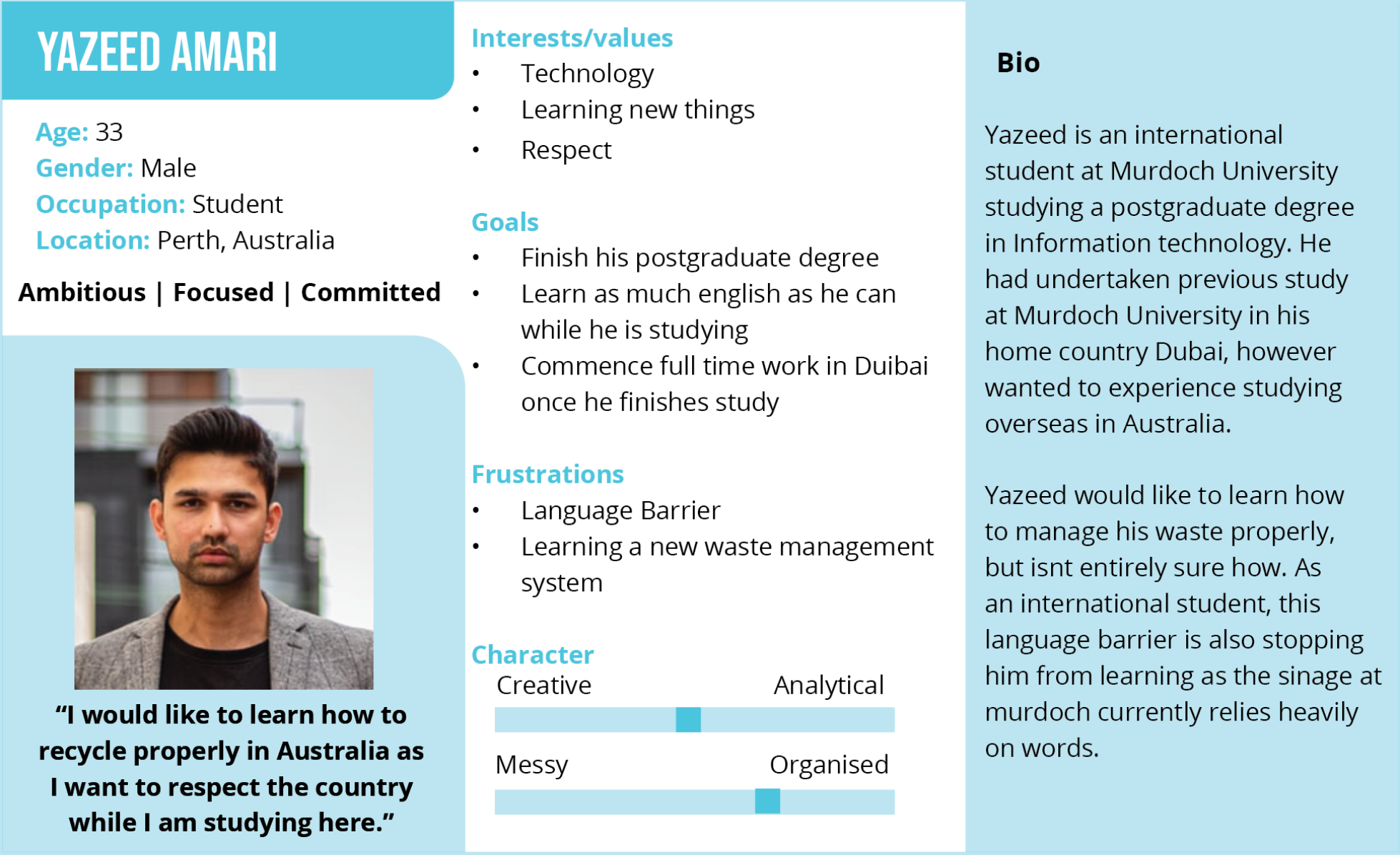
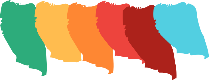
I first started the research phase by thinking about personas, and what types of people would use the waste management system at Murdoch. Being a university, the target audience was quite large and encompassed many people of different ages and backgrounds, and as such, many different personas were created to reflect the target audience as accurately as possible.
2. EMPATHY MAP
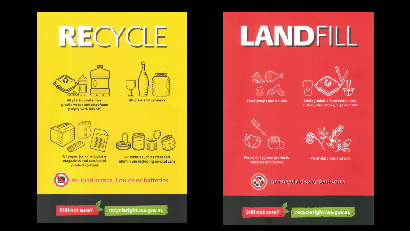
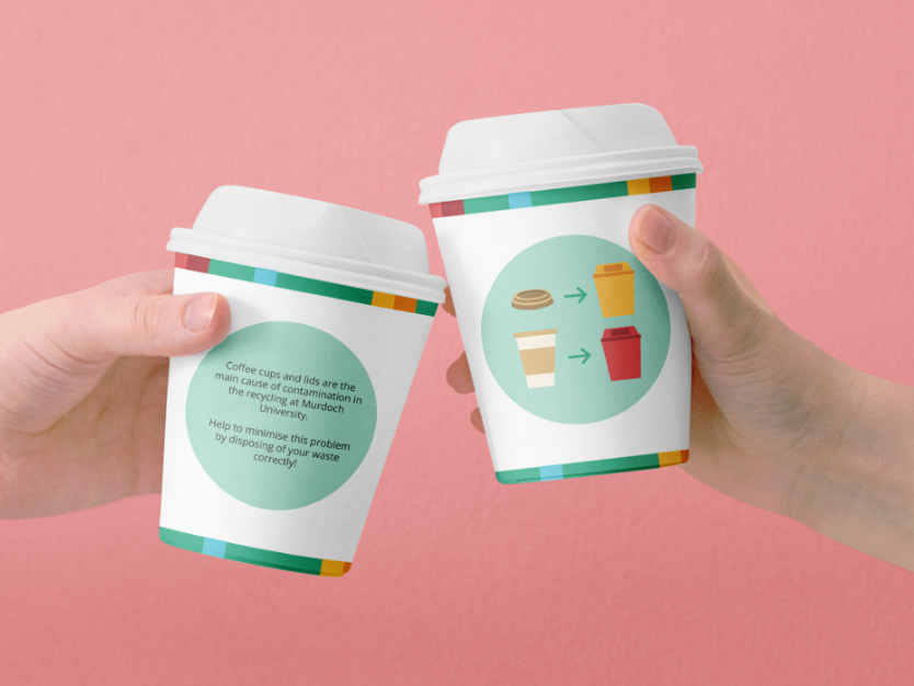
To gain a deeper understanding into the problem that was occurring, I conducted interviews around campus about recycling. Some of the questions I asked included:
- Do you think that the bin signage at Murdoch is effective? why/why not?
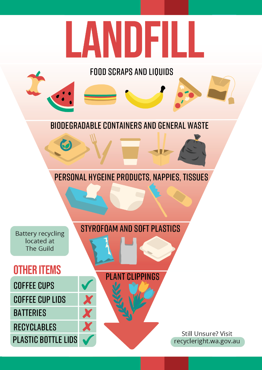
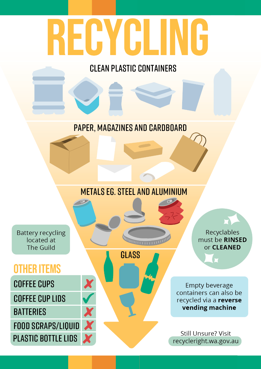
- Can you list some items that go into recycling and can you list some items that go into landfill?
- If the signs was more visually exciting, would you look at and use the signs?
- What do you think could be improved with the signage?
These questions proved that most people were ill-informed about the proper disposal of waste items, even if they were actively trying to recycle. From this, it was obvious that the signage was not effective and that something had to be done. Anempathy map was created based off of these interviews to gain a better understanding into the target audience.
2. EMPATHY MAP
To gain a deeper understanding into the problem that was occurring, I conducted interviews around campus about recycling. Some of the questions I asked included:
- Do you think that the bin signage at Murdoch is effective? why/why not?
- Can you list some items that go into recycling and can you list some items that go into landfill?
- If the signs was more visually exciting, would you look at and use the signs?
- What do you think could be improved with the signage?
These questions proved that most people were ill-informed about the proper disposal of waste items, even if they were actively trying to recycle. From this, it was obvious that the signage was not effective and that something had to be done. Anempathy map was created based off of these interviews to gain a better understanding into the target audience.
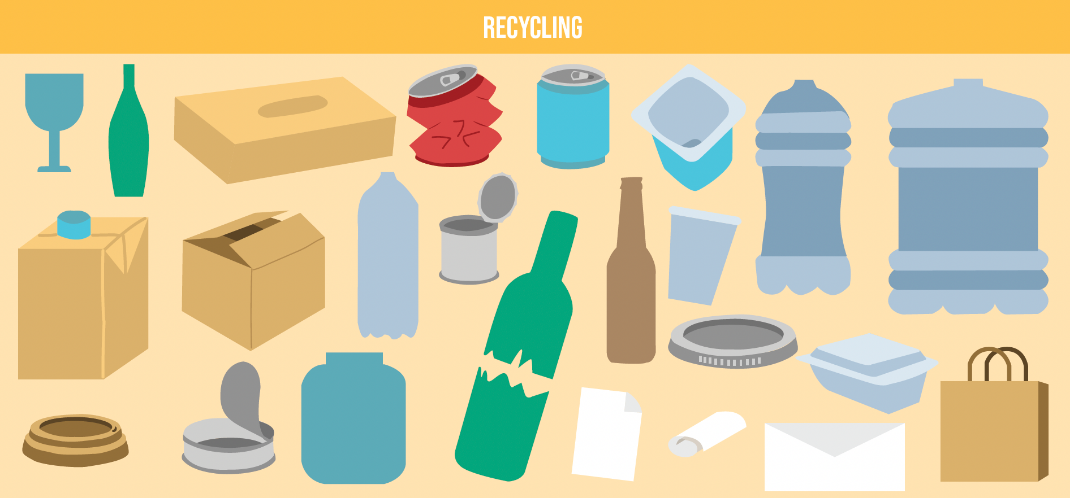
3. COMPETITOR ANALYSIS
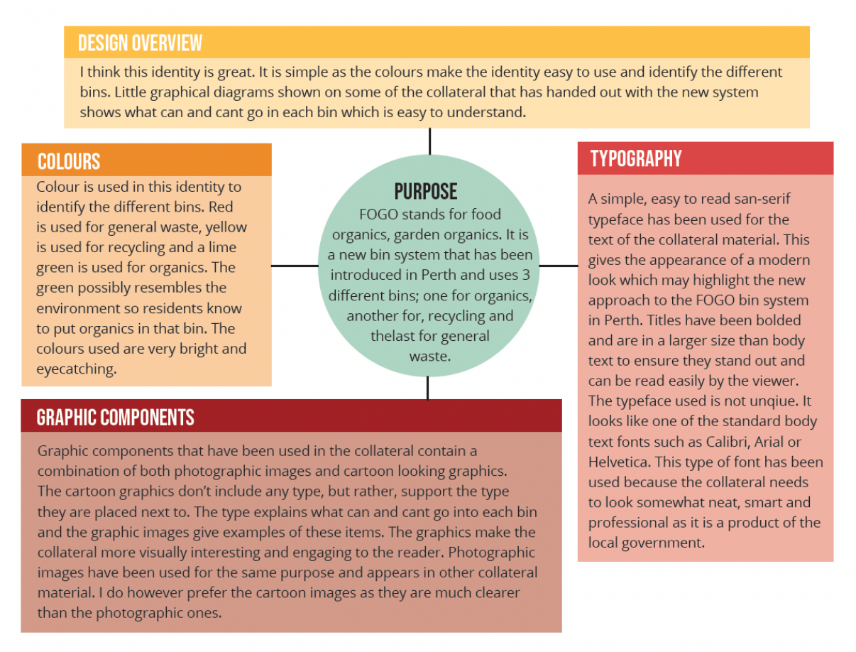
A competitor analysis of similar waste management systems was conducted to see what other identities did well and what they could improve on. From these, I found that have a colour system in place to differentiate the different bins was most effective and the use of graphics was important to help the target audience decipher what waste items go in which bin.
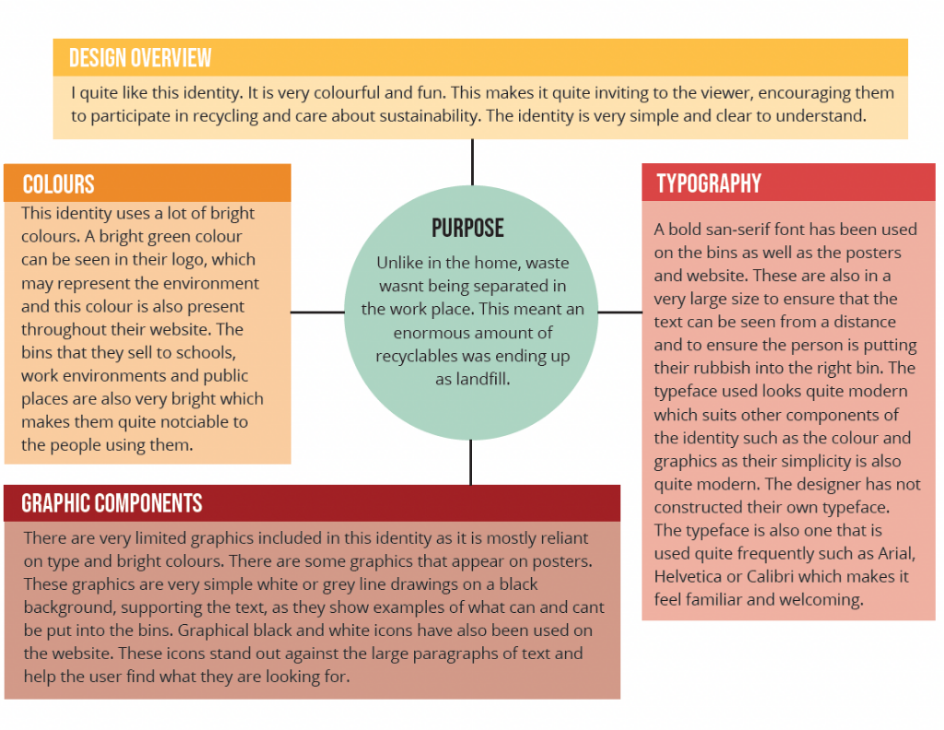
COMPETITOR ANALYSIS 1 - ECO BIN
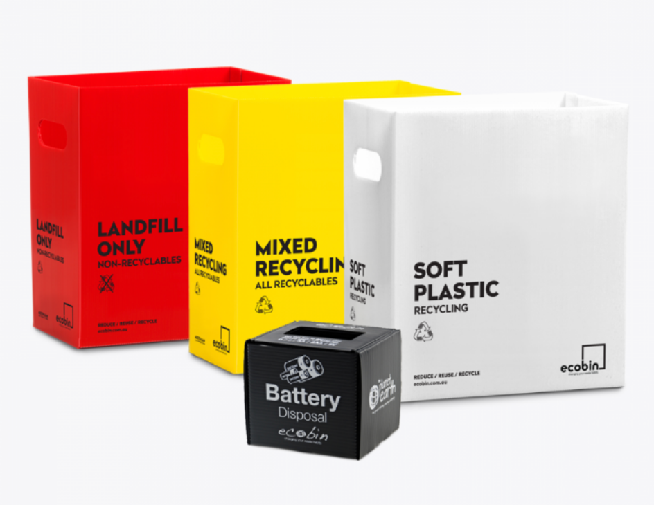
https://www.ecobin.com.au
I think this identity is very effective. The ecobins are very bright and colourful which makes the bins highly noticeable which ensures people put their items in the right bin. Each bin is colour coded depending on what items go in that bin. I think that I would improve on the graphics part of this identity. I would possibly make them more eye-catching, filling them with colour to suit the rest of the identity, as well as create more graphical images as the ones used are repeated many times.
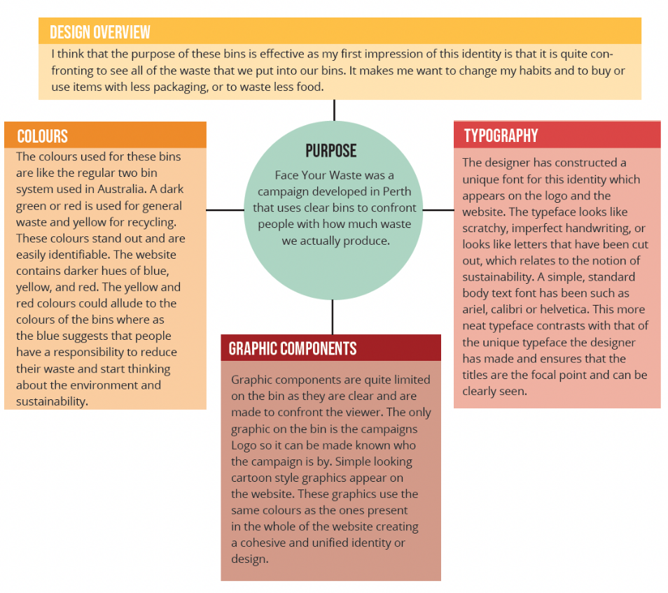
COMPETITOR ANALYSIS 2 - FACE YOUR WASTE
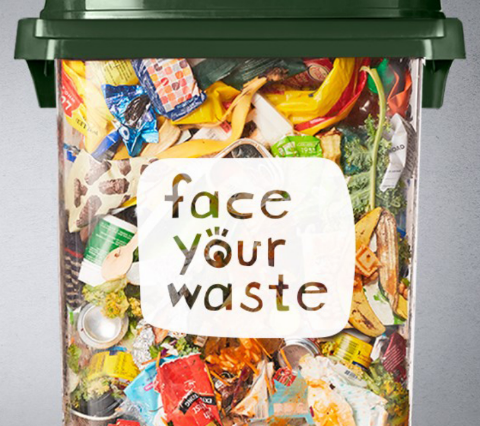
https://www.facebook.com/faceyourwaste/photos
I think this identity is effective in confronting people about the issue of waste and recycling as it is a clear bin and people can see how much rubbish is actually placed in these bins. The design of the bins is different to what is normally seen so people walking past may stop to have a look and think about the waste they produce on a daily basis. I don’t however feel this identity is effective in helping people sort between recyclables and general waste.This is because there is no information on the bins or the actual website about what items go in what bin. This could be improved by making have some graphics on the lid to show people what goes in each bin. This would not take away from the main purpose of the bin which is to confront people as it won’t be blocking the clear sides. I do also feel that the videos that they have posted on the website for the campaign feel a little out of place as they do not match the rest of the identity. I would change the videos to be more educational and possibly include animated aspects as this ‘cartoon’ style is present on the website.
COMPETITOR ANALYSIS 3 - FOGO
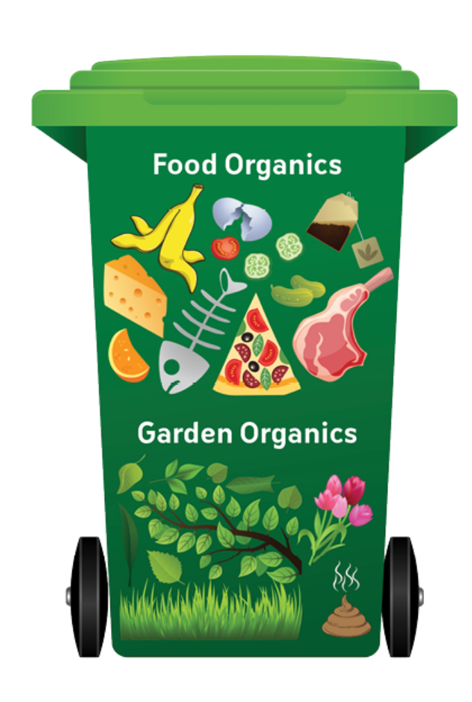
https://www.melvillecity.com.au/waste-and-environment/waste-recycling-fogo/3-bin-fogo-system/what-is-the-3-bin-fogo-system
https://www.melvillecity.com.au/waste-and-environment/waste-recycling-fogo/3-bin-fogo-system/what-is-the-3-bin-fogo-system
From what I have seen, I do think this identity is effective and it works. There are a few collateral products such as brochures and magnets that make the process very clear and describe in detail what belongs in each bin. Each bin can be easily identified as they each have different coloured lids for the different types of bins. One thing I would add to this identity would be to put signage of what can and can’t go in the bins, onto the actual bin. This is because if a resident isn’t sure, they may have to search it up on the internet. This process may be time consuming and the resident may not have the patience for this and therefore just put the item into any bin, not caring. Another addition I would add to this identity would be a website of some kind. All the information about this new FOGO system can be found on each local governments website. eg. City of Melville, City of Fremantle etc. It would make the process easier if they had one website where all the information and FAQs were placed. This website, as well as additional collateral material, would enhance the visual identity as I do feel this is lacking in the government websites, as they have their own identity.